New World

Share and discuss your images, image-editing techniques, and artworks.
Ice Cold
Posts: 221
Joined: 2008.10.07 (02:46)

Postby Sniperwhere » 2009.05.11 (19:53)

I've wanted to create a planetary desktop for so long. Now I know how.

The red one is the first planet I've ever created. I'm so damn proud of this.

Image

User avatar
Jedi Pimp
Posts: 676
Joined: 2008.09.27 (23:41)
NUMA Profile: http://nmaps.net/user/Erik-Player :://[[];lg
MBTI Type: ISFP
Location: Round Rock, Texas

Postby Erik-Player » 2009.05.11 (20:09)

Absolutely stunning.
Image
are any of my friends still here

User avatar
Antonio Banderas
Posts: 1703
Joined: 2008.09.26 (13:56)
NUMA Profile: http://nmaps.net/user/donfuy
MBTI Type: ISTP
Location: port

Postby Donfuy » 2009.05.11 (20:22)

The planets are really, really cool, but the background seems kind of boring, without the depth (that it's always associated with space), both space-wise as color-wise. Depth.
Sniperwhere wrote:I'm so damn proud of this.
You should be, because these are some fucking awesome planets. :D
Image

User avatar
Secretariat Ain't Got Nuthin' On This Shit
Posts: 521
Joined: 2009.01.08 (05:03)
NUMA Profile: http://nmaps.net/user/
MBTI Type: ISTJ
Location: Huntington, WV

Postby Ampersand » 2009.05.11 (21:26)

Jesus Christ, dude. Amazing stuff.
Image
mintnut wrote:Oh my life, STRAP ON A PAIR! Get over it, make better maps, innit?
Posts from the old forums: 11,194

Ice Cold
Posts: 221
Joined: 2008.10.07 (02:46)

Postby Sniperwhere » 2009.05.11 (21:40)

Donfuy wrote:The planets are really, really cool, but the background seems kind of boring, without the depth (that it's always associated with space), both space-wise as color-wise. Depth.
Sniperwhere wrote:I'm so damn proud of this.
You should be, because these are some fucking awesome planets. :D
My biggest issue is in fact the background. I think the stars are too clustered and it lacks a "spacey" feel to it.

And thanks for the feedback, guys.


One question: Do you think it's time I graduate from GIMP and move onto Photoshop or keep using GIMP?

User avatar
Cross-Galactic Train Conducter
Posts: 2354
Joined: 2008.09.27 (00:31)
NUMA Profile: http://nmaps.net/user/T3chno
MBTI Type: ENTJ
Location: foam hands
Contact:

Postby T3chno » 2009.05.12 (00:41)

Sniperwhere wrote:One question: Do you think it's time I graduate from GIMP and move onto Photoshop or keep using GIMP?
If you have the option to upgrade to Photoshop, do so immediately.


I really like the wallpaper, especially the fact that the closes planet has a nice smooth texture while the middle has a rough one. I agree with Donfuy about the depth though, I only wish some of the stars in the background were varied in size, brightness, or even slight tints of color.

I still think it's brilliant.
Image

User avatar
Subterranean Engineer
Posts: 1694
Joined: 2008.09.26 (16:15)
NUMA Profile: http://nmaps.net/user/Izzy
MBTI Type: INTP

Postby Izzy » 2009.05.12 (00:58)

Now /this/ needs lens Flare.
Image
Derived from ksktorngsig!
I don't think the universe has infinite material though, unless God makes DLC packs. - SkyPanda

Ice Cold
Posts: 221
Joined: 2008.10.07 (02:46)

Postby Sniperwhere » 2009.05.12 (01:24)

Techno wrote:
Sniperwhere wrote:One question: Do you think it's time I graduate from GIMP and move onto Photoshop or keep using GIMP?
If you have the option to upgrade to Photoshop, do so immediately.


I really like the wallpaper, especially the fact that the closes planet has a nice smooth texture while the middle has a rough one. I agree with Donfuy about the depth though, I only wish some of the stars in the background were varied in size, brightness, or even slight tints of color.

I still think it's brilliant.
I was using Scatter HVS(or something) which made the star effect, which maybe I should go back and replace.


And I tried the lens flare. Ew. GIMP 2.2 is not the tool for that.

And thank you for the comments guys. I really appreciate it.(and I'm not just saying that. My day has been made. :) )

User avatar
Unsavory Conquistador of the Western Front
Posts: 1568
Joined: 2008.09.26 (05:54)
NUMA Profile: http://www.nmaps.net/user/origami_alligator
MBTI Type: ENTP
Location: Portland, Oregon

Postby origami_alligator » 2009.05.12 (04:10)

One of the rules I learned in a really simple painting class was to never identify your light source. Of course, this rule can be broken, but I think for the best effect here you need to completely remove the giant sun that is in the top right. It's distracting and is really annoying to look at.

From there, I agree with a couple others: redo the background. It needs more of a "I'm in the dark and there are faint stars that are all around," rather than the stars being so clustered and taking up the bulk of the image. The whole thing is too flat as opposed to being deep.

I think you have a good start but it'll be quite a bit of work before I personally find it truly stunning. Appreciate the effort though! I'm sure it took a long time and that is something to be proud of, regardless of all the things I'm being picky about.
Image
.,,,,,@

"Listening intently, the thoughts linger ever vibrant. Imagine knowledge intertwined, nostalgiacally guiding/embracing."
<Kaglaxyclax> >>> southpaw has earned the achievement "Heartbreaker".
Promoted to the rank of Ultimate Four by LittleViking
[15:34] <Brttrx> ADDICTION IS GOOD, MR BAD INFLUENCE
[20:05] <southpaw> 8:05pm, Wednesday, 29 April, 2009, southpaw completed N.
[22:49] <makinero> is it orange-orange-gold yellow gold silverthread forest urban chic orange-gold?


User avatar
Loquacious
Posts: 1764
Joined: 2008.09.26 (15:37)
NUMA Profile: http://nmaps.net/user/Guitar_Hero_Matt
Location: lacks whiskers of mass destruction.

Postby MattKestrel » 2009.05.12 (07:14)

Well the background seemed like one big noise section, but the planets were really well rendered imo. Promising stuff.
Image

User avatar
Antagonistic Fencesitter
Posts: 347
Joined: 2008.09.21 (06:09)
NUMA Profile: http://nmaps.net/user/KinGAleX
Location: Australia, Australia, Australia

Postby KinGAleX » 2009.05.12 (13:25)

They're unrealistically close together. >:( There would be interplanetary crashes!

But the image itself is pretty nice.
Image
* Sig provided by Steve.
* Avatar manufactured by LittleViking.
More relevant images!

Image
Image

spect - There are more posts like this and it's like posting "I don't have any pie." in a Pie Forum.

Ice Cold
Posts: 221
Joined: 2008.10.07 (02:46)

Postby Sniperwhere » 2009.05.12 (18:55)

Manus Australis wrote:One of the rules I learned in a really simple painting class was to never identify your light source. Of course, this rule can be broken, but I think for the best effect here you need to completely remove the giant sun that is in the top right. It's distracting and is really annoying to look at.

From there, I agree with a couple others: redo the background. It needs more of a "I'm in the dark and there are faint stars that are all around," rather than the stars being so clustered and taking up the bulk of the image. The whole thing is too flat as opposed to being deep.

I think you have a good start but it'll be quite a bit of work before I personally find it truly stunning. Appreciate the effort though! I'm sure it took a long time and that is something to be proud of, regardless of all the things I'm being picky about.
The pickier you are, the happier I am. Because I can't be expected to learn from "Good job"'s all the time, not that I mind them. It's detailed feed back like that which help me know what to change. So thank you.

And yes. The planets are a little to close. Gotta fix that as well.

RoboBarber
Posts: 361
Joined: 2009.04.17 (09:55)
NUMA Profile: http://nmaps.net/user/Aphex_N
MBTI Type: ENFJ
Location: Arstar

Postby Aphex » 2009.05.24 (08:26)

Did you use a render for the planets?

Also if you can, upgrade to photoshop. This will also sort out your star problem, as i can send you some fantastic star brushes which would make this look epic.

Still i think that this wallpaper is very impressive :)

4.5/5
(if the stars were a little better would be a 5)
Image

User avatar
Subterranean Engineer
Posts: 1694
Joined: 2008.09.26 (16:15)
NUMA Profile: http://nmaps.net/user/Izzy
MBTI Type: INTP

Postby Izzy » 2009.05.24 (15:21)

Aphex_n wrote:Did you use a render for the planets?

Also if you can, upgrade to photoshop. This will also sort out your star problem, as i can send you some fantastic star brushes which would make this look epic.
He did say he made them. And on many occasions, he has thought about photoshop, but he always sticks to GIMP D:<
Image
Derived from ksktorngsig!
I don't think the universe has infinite material though, unless God makes DLC packs. - SkyPanda

Ice Cold
Posts: 221
Joined: 2008.10.07 (02:46)

Postby Sniperwhere » 2009.05.28 (23:50)

It just feels so foreign to me. Like I'm starting all over again.

Anyways, thank you for the compliments. I still need to get around to fixing those issues.

User avatar
Ego Lancer
Posts: 303
Joined: 2008.09.26 (06:13)
NUMA Profile: http://nmaps.net/user/PsychoSnail
MBTI Type: ISTP
Location: The Gaming subforum

Postby PsychoSnail » 2009.05.30 (05:33)

I agree that the planets are awesome but the background isn't - it just looks like a bunch of noise right now. Spreading the stars out more (after all, there is a lot of space in space) and adding some more variation among them would make this look a lot better. This illustrates pretty well what I mean.
spoiler

Image
Opera innovates, Firefox emulates.
Last updated: September 27th, 2009


User avatar
Unsavory Conquistador of the Western Front
Posts: 1568
Joined: 2008.09.26 (05:54)
NUMA Profile: http://www.nmaps.net/user/origami_alligator
MBTI Type: ENTP
Location: Portland, Oregon

Postby origami_alligator » 2009.05.31 (03:36)

PsychoSnail wrote:(after all, there is a lot of space in space)
Nuh-uh! It's all relative! D:<
Image
.,,,,,@

"Listening intently, the thoughts linger ever vibrant. Imagine knowledge intertwined, nostalgiacally guiding/embracing."
<Kaglaxyclax> >>> southpaw has earned the achievement "Heartbreaker".
Promoted to the rank of Ultimate Four by LittleViking
[15:34] <Brttrx> ADDICTION IS GOOD, MR BAD INFLUENCE
[20:05] <southpaw> 8:05pm, Wednesday, 29 April, 2009, southpaw completed N.
[22:49] <makinero> is it orange-orange-gold yellow gold silverthread forest urban chic orange-gold?


Ice Cold
Posts: 221
Joined: 2008.10.07 (02:46)

Postby Sniperwhere » 2009.06.01 (19:37)

PsychoSnail wrote:I agree that the planets are awesome but the background isn't - it just looks like a bunch of noise right now. Spreading the stars out more (after all, there is a lot of space in space) and adding some more variation among them would make this look a lot better. This illustrates pretty well what I mean.
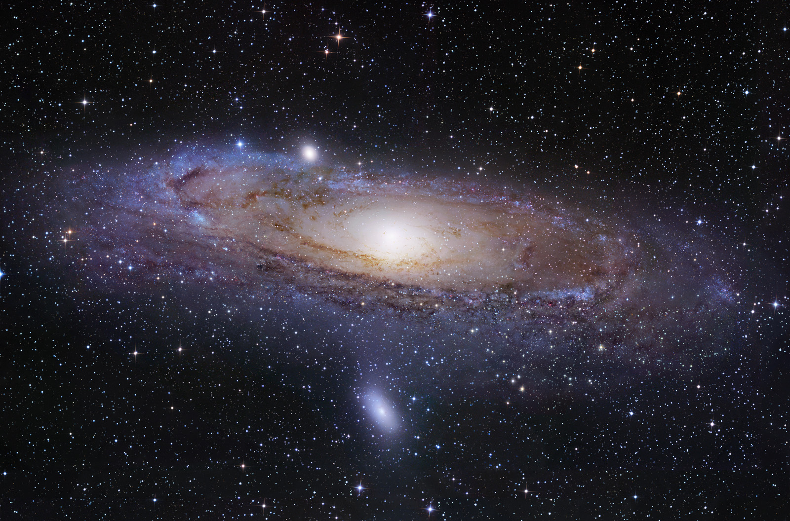
I know. I just need to find the time for that as each star will need to be custom. :/

Anyways, I decreased the density of the stars in the background and removed the sun. Now I need to get to work on the better stars. Also lowered space cloud density.

Image

User avatar
Ego Lancer
Posts: 303
Joined: 2008.09.26 (06:13)
NUMA Profile: http://nmaps.net/user/PsychoSnail
MBTI Type: ISTP
Location: The Gaming subforum

Postby PsychoSnail » 2009.06.02 (07:17)

Ah, that looks better. The clouds could stand out from the blackness a little more in my opinion, but that doesn't really matter.
spoiler

Image
Opera innovates, Firefox emulates.
Last updated: September 27th, 2009


Ice Cold
Posts: 221
Joined: 2008.10.07 (02:46)

Postby Sniperwhere » 2009.07.08 (00:22)

Another planet. I tried to give this one a ring, but the process I had in mind didn't work. Oh well. At least I got a planet that's better textured than anything i've ever done before out of it. :D

Image

User avatar
Walking on Broken Glass
Posts: 232
Joined: 2008.10.19 (22:19)
NUMA Profile: http://nmaps.net/user/%5D%7BNO3
Location: somewhere abusing a period key...

Postby //Zander » 2009.07.08 (02:24)

Yum!
It looks pretty cool.
Image

User avatar
Cross-Galactic Train Conducter
Posts: 2354
Joined: 2008.09.27 (00:31)
NUMA Profile: http://nmaps.net/user/T3chno
MBTI Type: ENTJ
Location: foam hands
Contact:

Postby T3chno » 2009.07.08 (04:52)

Stars are a -huge- improvement over your last one. Now if you could just vary their size, this would look incredible.

Planet is great, as usual.
Image

dreams slip through our fingers like hott slut sexxx
Posts: 3896
Joined: 2009.01.14 (15:41)
NUMA Profile: http://nmaps.net/user/Tunco123
MBTI Type: INTJ
Location: Istanbul

Postby Tunco » 2009.07.08 (08:43)

I think stars a bit over showed (it makes me look to the stars, more than the planet), but it's great though.
spoiler

Image


Ice Cold
Posts: 221
Joined: 2008.10.07 (02:46)

Postby Sniperwhere » 2009.07.08 (15:03)

Stars are a real hit and miss with this kind of thing. they're either good, or they're bad. But never "all right" XD

Anyways, glad you like the planet.

I think my one issue with stars is after I spend an hour or two on the planet itself, I look at the background and involuntarily think, "oh geez, how long's that gonna take." I'm gonna have to lose that atitude and be more patient.

Ice Cold
Posts: 221
Joined: 2008.10.07 (02:46)

Postby Sniperwhere » 2009.10.12 (20:31)

Image

Me playing around in photoshop. And before you ask about the stars, it wasn't laziness this time. I actually have no clue how to make good stars in photoshop. Any suggestions?

CS4 btw.


Who is online

Users browsing this forum: No registered users and 12 guests