Forum Skin, possibility
-

- The 700 Club
- Posts: 743
- Joined: 2008.09.30 (07:37)
- NUMA Profile: http://nmaps.net/user/jackass77
- MBTI Type: ESFJ
- Location: Australia
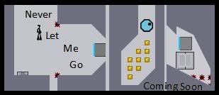
The Map Thumb in the Top Left Doesnt Really Work and Pops out from the rest making it look really ,,, err just bad for now but the rest looks alright but you need to consider that all the icons have to be the same instead of different ones for different WHATEVA there called's lol
[align=center]
Mine :: Techno :: Incluye :: GTM ::Skyline :: Riobe :: GTM 2[/align]
Mine :: Techno :: Incluye :: GTM ::Skyline :: Riobe :: GTM 2[/align]
-
- Unsavory Conquistador of the Western Front
- Posts: 1568
- Joined: 2008.09.26 (05:54)
- NUMA Profile: http://www.nmaps.net/user/origami_alligator
- MBTI Type: ENTP
- Location: Portland, Oregon
Forums. They are called forums.jackass wrote:The Map Thumb in the Top Left Doesnt Really Work and Pops out from the rest making it look really ,,, err just bad for now but the rest looks alright but you need to consider that all the icons have to be the same instead of different ones for different WHATEVA there called's lol
This looks pretty awful, to tell you the truth. Where's the sleek look? The vibrant colors would work if you could put them in a way that stood out and yet was low-key enough that they wouldn't be distracting but rather something interesting to look at. Get rid of that map thingy, make this bigger and actually forum sized rather than that tiny picture. I think that'd be a good start.
.,,,,,@
"Listening intently, the thoughts linger ever vibrant. Imagine knowledge intertwined, nostalgiacally guiding/embracing."
<Kaglaxyclax> >>> southpaw has earned the achievement "Heartbreaker".
Promoted to the rank of Ultimate Four by LittleViking
[15:34] <Brttrx> ADDICTION IS GOOD, MR BAD INFLUENCE
[20:05] <southpaw> 8:05pm, Wednesday, 29 April, 2009, southpaw completed N.
[22:49] <makinero> is it orange-orange-gold yellow gold silverthread forest urban chic orange-gold?
-

- Lifer
- Posts: 1066
- Joined: 2008.09.26 (18:37)
- NUMA Profile: http://nmaps.net/user/EdoI
- MBTI Type: INTJ
- Location: Zenica, Bosnia and Herzegovina
It's not that bad. I agree with most of things that jackass and Manus Australis said. What do you think about putting an image of that day's featured map (on the map thingy place)? But where is birthdays list?
Last edited by EdoI on 2009.01.08 (20:53), edited 1 time in total.
-
- Lifer
- Posts: 1066
- Joined: 2008.09.26 (18:37)
- NUMA Profile: http://nmaps.net/user/EdoI
- MBTI Type: INTJ
- Location: Zenica, Bosnia and Herzegovina
Well... It's somehow cold. I recommend you to keep up with the first one, but if you have time (once when the first skin is finished) you can finish the second skin. Both of them can get polished and user-friendly. What software do you use for making these? I just bought Photoshop CS4, and I'm thinking about making a skin.
And yeah, if you use that featured map image idea, don't forget to make that image be link to that map. Or whoever is the coder.
And yeah, if you use that featured map image idea, don't forget to make that image be link to that map. Or whoever is the coder.
Last edited by EdoI on 2009.01.08 (20:54), edited 1 time in total.
-

- The Konami Number
- Posts: 586
- Joined: 2008.09.19 (12:27)
- NUMA Profile: http://nmaps.net/user/Atilla
No offence, but that's hideous. Especially the stuff on the left. The layout clashes terribly with the rest of the design, and the constant changes in font size and weight make it look like a series of cheap newspaper ads. Also, having a map slideshow is a huge waste of bandwidth which would slow down the forums. If I wanted to browse maps, I would go to NUMA.
-
- Dance Dance Revolution Android
- Posts: 881
- Joined: 2008.09.28 (02:06)
- NUMA Profile: http://nmaps.net/user/TribulatioN
- MBTI Type: ESFP
- Location: Canada
I agree. I'd also like to emphasis the "no offense". The colours don't adhere with each other too well. With the font sizes, the first thing that came into my mind was cheap cardboard box containing toys for the 3+'s. Keep working on it!Atilla wrote:No offence, but that's hideous. Especially the stuff on the left. The layout clashes terribly with the rest of the design, and the constant changes in font size and weight make it look like a series of cheap newspaper ads. Also, having a map slideshow is a huge waste of bandwidth which would slow down the forums. If I wanted to browse maps, I would go to NUMA.
[ispoiler=http://i31.tinypic.com/111p9bo.png]gloomp : gloomp : Why Me : toasters : SkyRay : Slurpee@fpsbanana : KaMikA@Haklabs[/ispoiler]
 [spoiler=Neditor Nation]Currently Challenging: lord_day
 [/spoiler][spoiler=Puzzle of the Exuberant!]

 [/spoiler]
[spoiler=Neditor Nation]Currently Challenging: lord_day[/spoiler][spoiler=Puzzle of the Exuberant!][/spoiler]-
- It Must've Been Love
- Posts: 333
- Joined: 2008.09.27 (16:09)
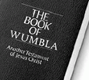
- NUMA Profile: http://nmaps.net/user/wumbla
i also agree, I wouldn't want it for my forum skin. but I appreciate people comming up with new skin designs.
EDIT: I like the blue one.
EDIT: I like the blue one.

eganic wrote:I WUMBLA
YOU WUMBLA
HE SHE ME
WUMBLA
-
- It Must've Been Love
- Posts: 344
- Joined: 2008.09.28 (02:34)
- NUMA Profile: http://nmaps.net/user/
- MBTI Type: INTJ
I'd like to see that basically as-is, with the slidshow removed and the rest of the left stuff down toward the bottom.
I'm not entirely sure that would be AWESOME, but I'd be interested to see what it does look like.
I'm not entirely sure that would be AWESOME, but I'd be interested to see what it does look like.

Other Project
Soon as in later. Probably post-December. However, aperture and I are in contact, so rest assured we are at least thinking about it.
-
- Lifer
- Posts: 1066
- Joined: 2008.09.26 (18:37)
- NUMA Profile: http://nmaps.net/user/EdoI
- MBTI Type: INTJ
- Location: Zenica, Bosnia and Herzegovina
It's good that you made it bigger. But it seems that you used some image resizer. That made it blurry. You definitely have to rewrite everything because letters are on some places unreadable. It's good that you added birthdays. It's good that you made all icons the same. I hope that you'll make difference between new posts and no new posts. I like the slideshow thing and the ads were necessary. Try implementing these and it will get better.BE_nSPIRED wrote:
Hows this edoi

-

- Remembering Hoxygen
- Posts: 972
- Joined: 2008.11.02 (06:13)
- NUMA Profile: http://nmaps.net/user/rikaninja
- Location: The darkness beyond hell.
Really really bad. But the black and orange is the best colour sheme on any skin I have seen yet. If you can jut fix up the top-left icon but keepthat blackorange colouring going I would like it. Just start over with those colours and a similar idea to this: http://metanet.wickedosity.net/index.php
If you can, or even these forums. That is a bit too original lol.
If you can, or even these forums. That is a bit too original lol.
Who is online
Users browsing this forum: No registered users and 7 guests