Thanks, SkyPanda.
Yeah, that's Photoshop's Wow Neon Layer Style on the text. As you can see in the RSS tag, I tried to do something to make the text stand out more, namely by making another layer of the text and applying different styles to the new layer. It worked a little bit, but it's still not great. Any Photoshoppers with suggestions?
Edit: Here's one where the text shouldn't be hard to read. This came out really well, I think.
EditEdit: Tried it with more opacity on the gloss. Better?
EditEditEdit: Eh, I think it's too much gloss. I like the first one better, but I'll leave 'em both up here for critique.
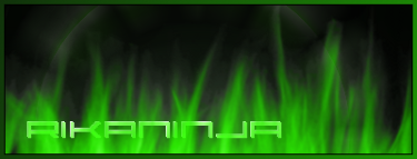
Edit^4: New self-advertising sigtag, for kicks. With and without extra border. Again, which is better?
Edit-to-the-fifth: And another sigtag...

--

--

--

--