I would like to know which style would be best for my writing website. I've been debating over design and re-design for a while now, and have finally decided to consult others. If you like a particular style, but would like to see something different in it, then please, I would love to know your opinions. I was going for something moderately simple with light blues, grays, and oranges.
Also, I would love to have your input on this page, it being the Index page.
One more thing; if you would like to help me create my website (or help manage my writing forum [speaking of which, no one really goes on anymore, for some reason. I guess I should spice it up a bit]) in any way, then please, comment here. I need help in turning a normal page into a template, and using it successfully. I can't seem to get it to work without the CSS images disappearing. Also, much later on, I would definitely want some help in creating a forum theme for my writing forum, since I have absolutely no idea how to do that. If you decide to help in any way, shape, or form, you will be credited in my website. Thanks for your input.
Which style do you prefer for my writing website?
-

- Life Time Achievement Award
- Posts: 262
- Joined: 2008.10.01 (00:38)


I do requests. v
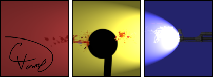
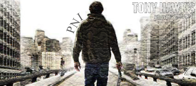
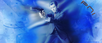
PNI's sig | #2 | #3
BNWN's sig
Rambo5252's sig
TribulatioN's sig
Isaacx's sig
nnn's sig
eganic's sig
deltainferno's sig
Slick265's sig
Sigs made for me
My competition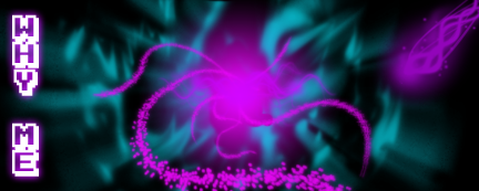
My writing forum
-

- Queen of All Spiders
- Posts: 4263
- Joined: 2008.09.29 (03:54)
- NUMA Profile: http://www.freeWoWgold.edu
- MBTI Type: ENFP
- Location: Quebec, Canada!
Style 1 is pretty excellent.
Loathes
-
- Yet Another Harshad
- Posts: 485
- Joined: 2008.09.26 (19:27)
- NUMA Profile: http://nmaps.net/user/skyline356
- MBTI Type: INTP
- Location: Connecticut
I think they're both horrendous looking, but I prefer the first to the second. Also, considering this is a writing website, maybe try coming up with a title that isn't so grammatically incorrect? :/

-

- Depressing
- Posts: 1977
- Joined: 2008.09.26 (06:46)
- NUMA Profile: http://nmaps.net/user/rennaT
- MBTI Type: ISTJ
- Location: Trenton, Ontario, Canada
- Contact:
Have you considered modifying a Wordpress theme rather than writing the code from scratch? I think it might turn out well with what you're working with.

'rret donc d'niaser 'vec mon sirop d'erable, calis, si j't'r'vois icitte j'pellerais la police, tu l'veras l'criss de poutine de cul t'auras en prison, tabarnak
-

- Retrofuturist
- Posts: 3131
- Joined: 2008.09.19 (06:55)
- MBTI Type: ENTP
- Location: California, USA
- Contact:
I'm leaning with #2, but only if you change that color behind text headings like "Book of the Month" to something lighter.
As for the intro... It actually took me a bit to figure out what I was looking at. Maybe you should move the navigation links away from the top-right corner to be in the user's face, and generally make the navigation thingies bigger so they're clearer to see.
Also, "ungrammatically correct" means something subtly different from "grammatically incorrect." You should use the latter.
Otherwise, I've never spent time learning how to do any of this sort of thing, so take my input with a shaker's worth of salt. And, like, good job.
[spoiler="you know i always joked that it would be scary as hell to run into DMX in a dark ally, but secretly when i say 'DMX' i really mean 'Tsukatu'." -kai]"... and when i say 'scary as hell' i really mean 'tight pink shirt'." -kai[/spoiler][/i]


-
- Life Time Achievement Award
- Posts: 262
- Joined: 2008.10.01 (00:38)
Yeah, we were pretty thrown together, I guess I could refine them. Also, they were made with the simple tools of Photoshop and Dreamweaver. Oh, and ungramatically is acutally a word, but I understand what you're saying. And I chose the name because, not only is it what I want to accomplish (but I'm actually not that well-read anymore for my age; I used to be, but I've stopped reading books, but I definitely will be reading a LOT more books), but it's also ironic, because, as you said Skyling, it isn't very gramtically correct. But so far, thanks for your input. I'll get working straight away when I get on the plane to get back home to the US. Thanks.
I do requests. v
PNI's sig | #2 | #3
BNWN's sig
Rambo5252's sig
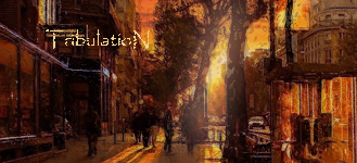
TribulatioN's sig
Isaacx's sig
nnn's sig
eganic's sig
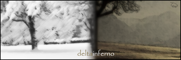
deltainferno's sig
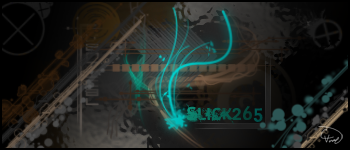
Slick265's sig
Sigs made for me
My competitionMy writing forum
-
- dreams slip through our fingers like hott slut sexxx
- Posts: 3896
- Joined: 2009.01.14 (15:41)
- NUMA Profile: http://nmaps.net/user/Tunco123
- MBTI Type: INTJ
- Location: Istanbul
Seconded.Skyling wrote:I think they're both horrendous looking, but I prefer the first to the second. Also, considering this is a writing website, maybe try coming up with a title that isn't so grammatically incorrect? :/
But I prefer third to first and second.


-
- Life Time Achievement Award
- Posts: 262
- Joined: 2008.10.01 (00:38)
Okay, thanks guys. I'll try to design (or imagine) a spectacular theme, but I will try to keep it simple, but maybe a bit modern or elegant? Also, I would like to have the main colours be blue with bits of orange. If anyone would like to help me innovate or create my writing website, not only would your help be greatly appreciated, but you would be mentioned and credited in the website. Thanks very much.
I do requests. v
PNI's sig | #2 | #3
BNWN's sig
Rambo5252's sig
TribulatioN's sig
Isaacx's sig
nnn's sig
eganic's sig
deltainferno's sig
Slick265's sig
Sigs made for me
My competitionMy writing forum
-
- Life Time Achievement Award
- Posts: 262
- Joined: 2008.10.01 (00:38)
Okay, I feel that this theme is much better than either of the other ones. It is almost complete; all I need to do is to find a way to put the pencils on the very left side of the page, find out how to make the words sub-menu links (though I think I might have a way to fix that) [fixed that], and to find a way to increase the load time. Anyway, here is the theme. Tell me what you think. I think that it not only looks better, but fits better with the idea of the website than either of the other ones.
I do requests. v
PNI's sig | #2 | #3
BNWN's sig
Rambo5252's sig
TribulatioN's sig
Isaacx's sig
nnn's sig
eganic's sig
deltainferno's sig
Slick265's sig
Sigs made for me
My competitionMy writing forum
-

- It Must've Been Love
- Posts: 342
- Joined: 2008.10.02 (20:10)
- NUMA Profile: http://nmaps.net/user/XiAH
- MBTI Type: ENFP
- Location: Naptown Indiana
- Contact:
WAY to much white space. Try compressing the components into a smaller area. An average person only reads the top half of the front page of a newspaper because they are too lazy to read the bottom half. The same is for websites. If you have little content at the top, people won't stay there very long.

^made by Life247^
 - Made by UniverseZero
Kickin' It Ninja Style! is at Episode 01-1 as of OCT11
OFFICIAL ENDORSEMENTS
A Small Bit of Code (Tweak), The Great Nation of Hispanyanlandia (OneSevenNine), The Land of Rape and Honey (87654321), Don (COMMET), Omega (COMMET), N: The Legacy (DarkN), U (Drathmoore), and My zombified-webcomic-which-needs-a-name (Wannas)
Quotes
[Old Forums: 341 (0.07% of total forum posts)]"My parents thinks I incredibly smart and has lots of expectations from me." -Tunco
Coming Soon
other sig - made by Vyacheslav
-
- Life Time Achievement Award
- Posts: 262
- Joined: 2008.10.01 (00:38)
Okay I'm not sure how to decrease it by more than about 30 px., which I've just done. Unless you think decreasing the size of submenu would suffice. Or maybe the notes should be made smaller...but I'm not sure how it would all quite fit so well after that...
EDIT: Also, it depends on what resolution you have on your computer. On a basic laptop resolution of 1280x800, you won't see the main body of the website, but you will see everything else. If you are using a basic desktop resolution of 1280x1024, you'll see a lot more.
EDIT: Also, it depends on what resolution you have on your computer. On a basic laptop resolution of 1280x800, you won't see the main body of the website, but you will see everything else. If you are using a basic desktop resolution of 1280x1024, you'll see a lot more.
I do requests. v
PNI's sig | #2 | #3
BNWN's sig
Rambo5252's sig
TribulatioN's sig
Isaacx's sig
nnn's sig
eganic's sig
deltainferno's sig
Slick265's sig
Sigs made for me
My competitionMy writing forum
-
- It Must've Been Love
- Posts: 342
- Joined: 2008.10.02 (20:10)
- NUMA Profile: http://nmaps.net/user/XiAH
- MBTI Type: ENFP
- Location: Naptown Indiana
- Contact:
Um, I have 1024x768, so...Why Me wrote:Okay I'm not sure how to decrease it by more than about 30 px., which I've just done. Unless you think decreasing the size of submenu would suffice. Or maybe the notes should be made smaller...but I'm not sure how it would all quite fit so well after that...
EDIT: Also, it depends on what resolution you have on your computer. On a basic laptop resolution of 1280x800, you won't see the main body of the website, but you will see everything else. If you are using a basic desktop resolution of 1280x1024, you'll see a lot more.
I'll try reworking your concept tomorrow, but personally I think that it is pretty generic.
^made by Life247^
- Made by UniverseZeroKickin' It Ninja Style! is at Episode 01-1 as of OCT11
OFFICIAL ENDORSEMENTS
A Small Bit of Code (Tweak), The Great Nation of Hispanyanlandia (OneSevenNine), The Land of Rape and Honey (87654321), Don (COMMET), Omega (COMMET), N: The Legacy (DarkN), U (Drathmoore), and My zombified-webcomic-which-needs-a-name (Wannas)
Quotes
[Old Forums: 341 (0.07% of total forum posts)]"My parents thinks I incredibly smart and has lots of expectations from me." -Tunco
Coming Soon
other sig - made by Vyacheslav
-
- Life Time Achievement Award
- Posts: 262
- Joined: 2008.10.01 (00:38)
But still, considering that I'm fourteen...nichtmesister wrote: I'll try reworking your concept tomorrow, but personally I think that it is pretty generic.
I do requests. v
PNI's sig | #2 | #3
BNWN's sig
Rambo5252's sig
TribulatioN's sig
Isaacx's sig
nnn's sig
eganic's sig
deltainferno's sig
Slick265's sig
Sigs made for me
My competitionMy writing forum
-
- It Must've Been Love
- Posts: 342
- Joined: 2008.10.02 (20:10)
- NUMA Profile: http://nmaps.net/user/XiAH
- MBTI Type: ENFP
- Location: Naptown Indiana
- Contact:
Um, considering that I'M fourteen...Why Me wrote:But still, considering that I'm fourteen...nichtmesister wrote: I'll try reworking your concept tomorrow, but personally I think that it is pretty generic.
But anyhow, I'm working on your design right now.
^made by Life247^
- Made by UniverseZeroKickin' It Ninja Style! is at Episode 01-1 as of OCT11
OFFICIAL ENDORSEMENTS
A Small Bit of Code (Tweak), The Great Nation of Hispanyanlandia (OneSevenNine), The Land of Rape and Honey (87654321), Don (COMMET), Omega (COMMET), N: The Legacy (DarkN), U (Drathmoore), and My zombified-webcomic-which-needs-a-name (Wannas)
Quotes
[Old Forums: 341 (0.07% of total forum posts)]"My parents thinks I incredibly smart and has lots of expectations from me." -Tunco
Coming Soon
other sig - made by Vyacheslav
-
- Life Time Achievement Award
- Posts: 262
- Joined: 2008.10.01 (00:38)
Okay, thanks. That's really helpful. If it goes well, I'll credit you on the website.
I do requests. v
PNI's sig | #2 | #3
BNWN's sig
Rambo5252's sig
TribulatioN's sig
Isaacx's sig
nnn's sig
eganic's sig
deltainferno's sig
Slick265's sig
Sigs made for me
My competitionMy writing forum
-
- dreams slip through our fingers like hott slut sexxx
- Posts: 3896
- Joined: 2009.01.14 (15:41)
- NUMA Profile: http://nmaps.net/user/Tunco123
- MBTI Type: INTJ
- Location: Istanbul
They are all too generic and detailed, if you're making a writing site, it theme should be simple.
-
- Life Time Achievement Award
- Posts: 262
- Joined: 2008.10.01 (00:38)
So like, just a menu, sub-menu, and the page text? Hm...I could do that...but I feel that it needs at least a little something more. How about on the top there's an image and the website name, with the menu below that. The sub-menu would sort-of 'expand' from the original menu, and the page body and text would be under a small separation between the menu. This would all span about 700 or 750 pixels across, and maybe there would be an ad either on one of the sides or on the very bottom of the page. What would you think of that? If you would like me to make a mock-up of what I'm talking about, it should not take too long.
I do requests. v
PNI's sig | #2 | #3
BNWN's sig
Rambo5252's sig
TribulatioN's sig
Isaacx's sig
nnn's sig
eganic's sig
deltainferno's sig
Slick265's sig
Sigs made for me
My competitionMy writing forum
-
- dreams slip through our fingers like hott slut sexxx
- Posts: 3896
- Joined: 2009.01.14 (15:41)
- NUMA Profile: http://nmaps.net/user/Tunco123
- MBTI Type: INTJ
- Location: Istanbul
I meant a style like metanet blog.Why Me wrote:So like, just a menu, sub-menu, and the page text? Hm...I could do that...but I feel that it needs at least a little something more. How about on the top there's an image and the website name, with the menu below that. The sub-menu would sort-of 'expand' from the original menu, and the page body and text would be under a small separation between the menu. This would all span about 700 or 750 pixels across, and maybe there would be an ad either on one of the sides or on the very bottom of the page. What would you think of that? If you would like me to make a mock-up of what I'm talking about, it should not take too long.
-
- Life Time Achievement Award
- Posts: 262
- Joined: 2008.10.01 (00:38)
Hmm...okay, I'll try working something out
I do requests. v
PNI's sig | #2 | #3
BNWN's sig
Rambo5252's sig
TribulatioN's sig
Isaacx's sig
nnn's sig
eganic's sig
deltainferno's sig
Slick265's sig
Sigs made for me
My competitionMy writing forum
-
- Life Time Achievement Award
- Posts: 262
- Joined: 2008.10.01 (00:38)
Okay, well, I can't think of a good design like the Metanet Blog without being the Metanet Blog.
I do requests. v
PNI's sig | #2 | #3
BNWN's sig
Rambo5252's sig
TribulatioN's sig
Isaacx's sig
nnn's sig
eganic's sig
deltainferno's sig
Slick265's sig
Sigs made for me
My competitionMy writing forum
-
- dreams slip through our fingers like hott slut sexxx
- Posts: 3896
- Joined: 2009.01.14 (15:41)
- NUMA Profile: http://nmaps.net/user/Tunco123
- MBTI Type: INTJ
- Location: Istanbul
Ahah.Why Me wrote:Okay, well, I can't think of a good design like the Metanet Blog without being the Metanet Blog.
Something like this would be nice.
-
- Life Time Achievement Award
- Posts: 262
- Joined: 2008.10.01 (00:38)
Okay, hopefully I'll be able to try and make something good out that design. Mostly my tries with other styles haven't been so effective. Also, I found this website, and I thought that it looked really good. However, there is o way that I would be able to reproduce this.
EDIT: Wait...did you mean take the pre-made theme that it has there, or create a theme based around the website's theme? If it's the latter, that's what I was referring to. If the former, then I could easily do that.
EDIT: Wait...did you mean take the pre-made theme that it has there, or create a theme based around the website's theme? If it's the latter, that's what I was referring to. If the former, then I could easily do that.
I do requests. v
PNI's sig | #2 | #3
BNWN's sig
Rambo5252's sig
TribulatioN's sig
Isaacx's sig
nnn's sig
eganic's sig
deltainferno's sig
Slick265's sig
Sigs made for me
My competitionMy writing forum
-
- dreams slip through our fingers like hott slut sexxx
- Posts: 3896
- Joined: 2009.01.14 (15:41)
- NUMA Profile: http://nmaps.net/user/Tunco123
- MBTI Type: INTJ
- Location: Istanbul
It was an example, just to give you ideas if you're stuck.Why Me wrote:EDIT: Wait...did you mean take the pre-made theme that it has there, or create a theme based around the website's theme? If it's the latter, that's what I was referring to. If the former, then I could easily do that.
-
- Life Time Achievement Award
- Posts: 262
- Joined: 2008.10.01 (00:38)
Okay, thanks. I'll check them out and try to take some ideas and implement them.
Hmm, I have a good idea for a good theme now, but I can't create it at all. I must be much worse at web/image design than I thought. :/ This saddens me.
I have realized what I was doing wrong. I was always using tables, and I have just now realized the power of div tags. They are probably one of the most useful tools that I'm aware of.
Last edited by Why Me on 2009.09.19 (16:29), edited 1 time in total.
I do requests. v
PNI's sig | #2 | #3
BNWN's sig
Rambo5252's sig
TribulatioN's sig
Isaacx's sig
nnn's sig
eganic's sig
deltainferno's sig
Slick265's sig
Sigs made for me
My competitionMy writing forum
-
- Life Time Achievement Award
- Posts: 262
- Joined: 2008.10.01 (00:38)
Okay, here is a whole new page/design. The body text, sidebar text, and header text will be changed, but I'm only showing the theme for right now. Obviously, it needs a bunch of refining, but I may just hand this over to someone to do that, as I wouldn't do that very well. Also, the 'Contact' wedge of the menu bar I want to expand to show an option for a second page, but, again, I'm not sure how. I tried using a Spry menu bar, but it doesn't fit with the other buttons at all. I would like to have a 'Search' tool on the right side of the menu bar, but I am not aware of how to do that, either. I would love to hear your opinions, if it's not too much trouble. If you would be so kind as to help, as well, I would be extremely gratified.
EDIT: Hmm...for the Contact wedge expanding scenario, do you suppose that I could put a rollover image there, and then have the rollover image contain the second page's link? Wait, but wouldn't the larger image push down the stuff below it (the main page text), instead of just overlap it? I'll have to try this out. If anyone knows whether I could do this or not, please tell me.
Nevermind. All it does it resize the image to fit the space provided. If anyone knows of a way to do what I'm trying to do, I would love to know.
I do requests. v
PNI's sig | #2 | #3
BNWN's sig
Rambo5252's sig
TribulatioN's sig
Isaacx's sig
nnn's sig
eganic's sig
deltainferno's sig
Slick265's sig
Sigs made for me
My competitionMy writing forum
Who is online
Users browsing this forum: No registered users and 5 guests