Color Battle
- Semimember
- Posts: 21
- Joined: 2009.08.31 (19:18)
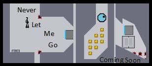
Color Battle: A Webcomic I hope will continue:
http://colorbattlecomic.blogspot.com/
EDIT: Just so you know, for White's speach, I just typed it in Black then filled it with White. Problem is, this only works for big font. I want it to show at any size, so what should I do?
P.S. There will be grey characters, so don't suggest I do grey.
http://colorbattlecomic.blogspot.com/
EDIT: Just so you know, for White's speach, I just typed it in Black then filled it with White. Problem is, this only works for big font. I want it to show at any size, so what should I do?
P.S. There will be grey characters, so don't suggest I do grey.
death is, in and of itself, fascinating. sex... why deemed inappropriate? something that has always bugged me. shadows fall and the cities rise, sunlit moonrays take to the skies, this poem made no sense, all it did was rhyme. funny how people can be so... human... scary, more like. the people scare me. you never know what they'll say. i prefer criminals. at least you know when they'll shoot. "Once is Once"-L, Death Note Volume 5
- Queen of All Spiders
- Posts: 4263
- Joined: 2008.09.29 (03:54)
- NUMA Profile: http://www.freeWoWgold.edu
- MBTI Type: ENFP
- Location: Quebec, Canada!
Don't double post, your comic sucks. Etcetera.
Loathes
- Semimember
- Posts: 21
- Joined: 2009.08.31 (19:18)
...ouch...SlappyMcGee wrote:Don't double post, your comic sucks. Etcetera.
death is, in and of itself, fascinating. sex... why deemed inappropriate? something that has always bugged me. shadows fall and the cities rise, sunlit moonrays take to the skies, this poem made no sense, all it did was rhyme. funny how people can be so... human... scary, more like. the people scare me. you never know what they'll say. i prefer criminals. at least you know when they'll shoot. "Once is Once"-L, Death Note Volume 5
- It Must've Been Love
- Posts: 344
- Joined: 2008.09.28 (02:34)
- NUMA Profile: http://nmaps.net/user/
- MBTI Type: INTJ
And I sort of have the copyright on the black/white/grey scheme ;)
In seriousness, though, here's some
Honest Criticism:
Don't cut & paste. Okay, well, you can cut and paste every once in a while, but DON'T cut, paste, and zoom in, because you end up with a pixel-y look as demonstrated in page 1 panel 3, which is accentuated by the fact that the character is drawn without such pixelation (only the normal stuff you find in paint)
I like the border in the second page more than the lack of it in the other two. Although I would use a less harsh color and depending on the colors you plan to incorporate (characters), perhaps a more neutral one?
Rainbow text is bad
Some people are attracted to photos in the comics, but the way you placed it there with no real explanation and please don't tell me the explanation is that the eye was supposed to represent someone outside the "fourth wall" looking in because if that was the case it would be looking toward where we were looking and not toward us was not good.
I kind of like what you did with white's text, but because of the discrepancy in how it looks in panel 5 (which I like) and panel 3 (which is terrible), I'm not entirely convinced you did it intentionally. Remember: You don't have to do it right, you just have to look like you did it right.
This might seem like a nitpick, but aren't those buckets really full? If it's meant to be open, try putting a few more layers of grey down. If it's meant to be closed, put a few more layers of grey toward the center
In page 2, panels 6 and 7 are forgivable, but in 8, 9, and 10 it's really hard to tell what is happening... or even if anything is happening at all?
I approve of making panels different sizes, but when the differences are -that- slight, it doesn't feel like it's intentional.
Other things:
I like your posing. A lot. I'm definitely not a posing expert, but what I see is very good.
I am not going to tell you not to use Paint, but I'm sure someone might. This is really your decision, but to be honest, if you drew that in Paint, you could probably benefit from the smoother lines you could get from GIMP or Inkscape. Both of these are free, just google them if you feel so inclined.
We're a pretty small community, and if you clean your comic visually, I would look for other avenues to get viewers and criticisms from.

Other Project

Soon as in later. Probably post-December. However, aperture and I are in contact, so rest assured we are at least thinking about it.
-
- dreams slip through our fingers like hott slut sexxx
- Posts: 3896
- Joined: 2009.01.14 (15:41)
- NUMA Profile: http://nmaps.net/user/Tunco123
- MBTI Type: INTJ
- Location: Istanbul
Shut it.Turiski wrote:We're a pretty small community.
Well, of course, I can say that this comic is bad sucks, especially the graphics.


- King Sanchez De La Cruz Magnifico IV: Return of Lenny Laser-Tits
- Posts: 890
- Joined: 2008.09.26 (12:21)
- NUMA Profile: http://nmaps.net/Weisslenny0
- MBTI Type: ENFJ
- Location: Canberra
- Contact:
I can't give honest feedback because I can't read it.
I feel like my friend, who I spent several minutes antagonising over having glasses and not being able to adjust his eyes. Problem is, I still don't think I could read this with glasses.
Also, if you're going to talk about a comic here, it's always nice to update here as well.
I feel like my friend, who I spent several minutes antagonising over having glasses and not being able to adjust his eyes. Problem is, I still don't think I could read this with glasses.
Also, if you're going to talk about a comic here, it's always nice to update here as well.


<&Yanni> I've had an ambient song like this playing for a couple hours,
<&Yanni> Oh no wait that is MY AIR CONDITIONER
-----
<@Animator> :::: Techno was killed by a better music genre.
-----
<SouthyMcGee> Music is auditory art. What art is a different argument.
----
<&sforzando> Alright, no 247MHz for you.
Previous Custom Member Titles: Cross-Country Sticker King 2k10, Doing Out the Girls, Outdoing the Girls, Lenny Laser-Tits, King Sanchez De La Cruz Magnifico IV: Return of Lenny Laser-Tits (current).
- Mr. Glass
- Posts: 2019
- Joined: 2008.09.27 (20:22)
- NUMA Profile: http://nmaps.net/user/astheoceansblue
- MBTI Type: ENTP
- Location: up down left right start A start
You spelt colour without a u. I hate you forever.
click sig :::


n
::: astheoceansblue
::: My eight episode map pack: SUNSHINEscience
::: Map Theory: The Importance of Function & Form
-
M U S I C
::: The forest and the fire: myspace
::: EP available for FREE download, here.
-
A R T
::: Sig & Avatar Artwork by me - see here!
-
G A M I N G
::: Steam ID: 0:1:20950734
::: Steam Username: brighter
Who is online
Users browsing this forum: No registered users and 8 guests