Page 1 of 1
Metanet Gray Design
Posted: 2008.09.28 (03:05)
by T3chno
What do you think?
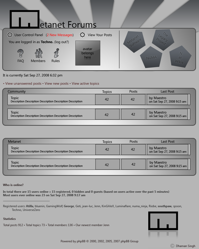
If it gets cut off, here's the straight link:
-Link-
Re: Metanet Gray Design
Posted: 2008.09.28 (03:13)
by Skyling
Far too bland, the header is really contrived, and the "shiny" boxes look cheesy and unprofessional. I dislike the "your avatar here" feature, as I don't think the avatar is really important enough to be displayed there. The hexagons look atrocious and don't fit in with the rest of the theme. I like the "FAQ", "Members", and "Rules" buttons, though.
Re: Metanet Gray Design
Posted: 2008.09.28 (03:27)
by Templex
What Skyline said, plus major space waste.
Re: Metanet Gray Design
Posted: 2008.09.28 (03:38)
by Animator
What Skyline and Templex said, plus those flash Hollywood light things at the very top really don't look nice.It needs more color, better spacing, and more sleek design (which is why I love the Soul City skin.) The gradients are also a bit generic.
Re: Metanet Gray Design
Posted: 2008.09.28 (03:39)
by Condog
It's so depressing. For a grey theme to work, you still need to have other colours involved somewhere.
Re: Metanet Gray Design
Posted: 2008.09.28 (04:08)
by T3chno
Hmmm. Yeah, it is flat and I'll buff it up with better colors.
Re: Metanet Gray Design
Posted: 2008.09.28 (07:57)
by Eiturlyf
I hate gray for website designs. It feels so boring.
What everyone else said plus MOAR COLOR.
Re: Metanet Gray Design
Posted: 2008.09.28 (10:50)
by t̷s͢uk̕a͡t͜ư
I think someone likes maestro.
Re: Metanet Gray Design
Posted: 2008.09.28 (11:11)
by Chase
It's too grey. Try using some free-license icons for the forums. They're everywhere, search Web Icons or Developers Icons on dA. The topic sections would do better in white or black, depending on what you're after.
Re: Metanet Gray Design
Posted: 2008.09.28 (12:33)
by Lenny
Hmm. It 's nice... however I think it might be painful to code.
And yeah, perhaps a bit too grey. Maybe have blues or blacks for the topics or something.
Re: Metanet Gray Design
Posted: 2008.09.28 (12:57)
by runningninja
Needs more blue and black.
Otherwise, I quite liked it. Just that it's bland.
Re: Metanet Gray Design
Posted: 2008.09.28 (13:18)
by notsteve
i liked it :)
Re: Metanet Gray Design
Posted: 2008.09.28 (15:21)
by Chad
b.l.a.n.d. bland
doesnt have to be fruity,
but still
Re: Metanet Gray Design
Posted: 2008.09.28 (16:45)
by Turtle
After you add color, be sure to get rid of the rays of light, and change those pentagons into hexagons, or get rid of them entirely. They give me a headache.
Re: Metanet Gray Design
Posted: 2008.09.28 (23:19)
by Geti
burn the pentagons away, and make everything a tad more square, or use 45 degree stuff. make in N-ish, or metanet-ish, like m+r's site.
i dont like it too much yet, though it still looks mocky.
edit: hey, yay, im on :)
Re: Metanet Gray Design
Posted: 2008.09.29 (01:14)
by T3chno
Don't worry, I'm working on a much better, not-bland, and organized theme.
Re: Metanet Gray Design
Posted: 2008.10.01 (15:55)
by kkstrong
I liked the top and the bottom, however the middle part with the threads and such need work.
I wonder how it would look if you turned all drak gray into black, and all light in medium-dark blue.
Re: Metanet Gray Design
Posted: 2008.10.01 (19:22)
by Creampudding
It looks good, but kinda boring. Add some more colors. Red maybe?