Page 1 of 2
Riobe's Signatures-isaacx, pick up your sig!
Posted: 2008.10.09 (21:35)
by Riobe
Re: Riobe's Sigs In Progress
Posted: 2008.10.09 (21:39)
by Pheidippides
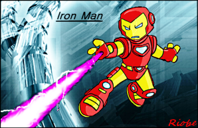
The first one is cool, but the cartoony Iron Man looks out of place on that detailed background. You're off to a good start, though.
Re: Riobe's Sigs In Progress
Posted: 2008.10.09 (22:05)
by Riobe
Pheidippides wrote:The first one is cool, but the cartoony Iron Man looks out of place on that detailed background. You're off to a good start, though.
Okay, I see how I'm not supposed to clash colors. Thank you. =)
Re: Riobe's Sigs In Progress
Posted: 2008.10.09 (23:06)
by jacobr
Hey Riobe can you make me a sig please. THANKS!!
Re: Riobe's Sigs In Progress
Posted: 2008.10.09 (23:17)
by Riobe
Please be a little more specific. What should the theme or character be?
Re: Riobe's Sigs In Progress
Posted: 2008.10.10 (01:55)
by Superpok
not so much of a color clash, but more of a high/low detail
Re: Riobe's Sigs In Progress
Posted: 2008.10.10 (04:22)
by origami_alligator
clashing colors isn't much of a problem if you can blend it well. I think the thin outline around Iron Man works just fine when moving from the red and yellow to the blue. It's mostly just that the cartoon Iron Man and the non-cartoon background clash. It's a clash of themes, not of colors, or at least that's what it looks like to me.
Re: Riobe's Sigs In Progress
Posted: 2008.10.12 (21:24)
by Riobe
Thanks.
Two more sigs! They're kinda horrible, but they're ok. Just testing out some cool font.

Yes, UnknownKirbyMan requested this. I was testing out some new Pokemon font I found (courtesy of southpaw posting some cool font place links in someone elses image thread. =D)

I know they're bad, but advice is necessary please. =)
Re: Riobe's Sigs In Progress
Posted: 2008.10.12 (21:25)
by Izzy
Mickey Mouse can levitate!?
Re: Riobe's Sigs In Progress
Posted: 2008.10.12 (21:27)
by Riobe
XD Knew that was coming.
Re: Riobe's Sigs In Progress
Posted: 2008.10.13 (03:57)
by origami_alligator
Riobe wrote:
First of all, the effect works really well in this until you look at the lower line of the clouds. The color goes from a pale white-blue to just a pale blue, and personally I think that needs some work. Maybe a blur would have worked here because then it would have just looked like a gradient instead of a cutoff line.
Riobe wrote:
On the other hand, the effect did not work in this sig. There is too much variation on the castle for the contour/bevel/posterization effect to properly work. In the first sig it was nice because it was outlining boundaries of things that may not have been seen otherwise, like the clouds and the boat. In this one the castle is pretty obvious and the poster effect just makes it seem too obvious, if you get what I'm saying.
Also, I don't know where the image came from but Micky Mouse is not needed at all. I would have liked to see Tinkerbell, actually, since she can fly and is usually seen hovering around the top of the Disney castle... Unless you had Fantasia Mickey... *remembers Fantasia and smiles*
Glad you found some use from the font sites, but try incorporating them into the sig more. UnknownKirbyMan's sig is a good start but the font could have been a bit smaller and maybe followed the line underneath the clouds, and also a little bit more pale, to blend in with the sig instead of being it's own separate thing. Also, don't use the same effect from the sig on the font. It turned out looking pretty bad.
Overall you're progressing a little. Slowly, but that's of no concern. Try using different effects next time. Just one filter at a time is fine, and don't be afraid to spend a few days on it until you think it really looks great. Practice sigs are awesome to make because then you can go crazy and do whatever effects you want and nobody will care. If you happen to make something really awesome then post it! I recommend just messing around with your image program for now though.
Re: Riobe's Sigs In Progress
Posted: 2008.10.13 (09:53)
by Riobe
Ok, cool. I really appreciate all the advice. Seriously, thanks a lot. =)
*Goes off*
EDIT: This was heavily inspired by one of your sigs. =)
Good?
Re: Riobe's Sigs In Progress
Posted: 2008.10.13 (11:12)
by otters
YES.
If you're a beginner, and you make something like that, you're on the road to success.
Re: Riobe's Sigs In Progress
Posted: 2008.10.13 (16:12)
by origami_alligator
Aha! which one? :P
That is very good. I mean, sheesh, that's a huge improvement over your other stuff. The text is perfecto, the colors are great, everything lines up... if I could say one thing about the sig I would say that maybe the letters should have been spaced a little further apart, so that the "o" would line up with the marks in the wall. But that is of little concern, really. The gray border was a good choice as well, seeing as how the forums are dark, but it didn't contrast too much with the background you were putting it on. With the old forums I don't think the gray would have worked at all, so good on your part.
What an outstanding improvement. Keep it up, I think with that sig you can probably handle the ropes from here, though I'll drop in and give advice if I think you need it :]
Last thing: keep experimenting.
Hope to see some really great stuff from you in the future, Riobe.
Re: Riobe's Sigs In Progress
Posted: 2008.10.13 (23:24)
by T3chno
Riobe wrote:Ok, cool. I really appreciate all the advice. Seriously, thanks a lot. =)
*Goes off*
EDIT: This was heavily inspired by one of your sigs. =)
Good?
That's probably the best 4-post-improvement I've seen in a long while. You completely eliminated all the pixels!
Re: Riobe's Sigs In Progress
Posted: 2008.10.14 (00:59)
by origami_alligator
wait, waitwait. Hold on.
Is that the broken wall from the bathroom in The Matrix? Y'know, when they're climbing down the walls of the apartment and then Neo sneezes and the agents take Morpheus?
If not, it looks very similar...
Re: Riobe's Sigs In Progress
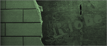
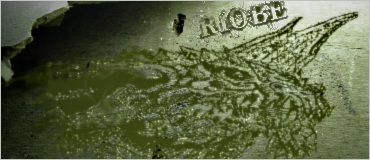
Posted: 2008.10.14 (09:36)
by Riobe
Thanks guys for all the positive feedback. =D
To be honest, I have no idea what wall this is. If you want,
here's the original pick. I tinted it a bit, and I found some really cool font (VTKS Revolt, actually) and tinted that. Then I tinted the whole image slightly green.
Plus, I've only seen like half of a Matrix movie, and I don't even know if that's the one. I've never really been into that kind of stuff, but I guess it couldn't hurt to watch a few. XD
Re: Riobe's Sigs In Progress
Posted: 2008.10.16 (22:10)
by wumbla
can you make me a sig? I don't really know what I want, I just need a sig so I have one.
Re: Riobe's Sigs In Progress
Posted: 2008.10.17 (07:55)
by Riobe
I suppose so. Remember, I'm not pro yet. =P
Re: Riobe's Sigs In Progress
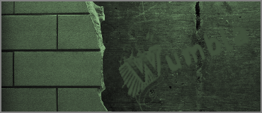
Posted: 2008.10.19 (03:36)
by wumbla
can you replace your name for my name on the sig you made with the wall?
Re: Riobe's Sigs In Progress
Posted: 2008.10.19 (05:53)
by Riobe
I had something else in mind, but I could do that, sure.
I'll even do the other one I was planning on doing, once I get the time.
Re: Riobe's Sigs In Progress
Posted: 2008.10.19 (15:13)
by BNW
/me wants siggy.
Please.
Thanks!
Re: Riobe's Sigs In Progress
Posted: 2008.10.19 (18:33)
by Riobe
Wee! Business is booming! XD
Wumbla, your sig is finished. Please tell me if you'd like it redone.
Re: Riobe's Sigs In Progress
Posted: 2008.10.19 (20:05)
by origami_alligator
Riobe wrote:Wee! Business is booming! XD
Wumbla, your sig is finished. Please tell me if you'd like it redone.
please tell me you have Photoshop so I can help you blend the text on that a bit better. *hopeful*
Re: Riobe's Sigs In Progress
Posted: 2008.10.20 (01:45)
by wumbla
I tried making my name clearer by darkening the backround, tell me if you like it
I used photoshop


