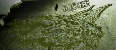
Riobe wrote:
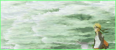
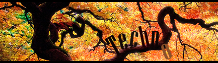
First of all, the effect works really well in this until you look at the lower line of the clouds. The color goes from a pale white-blue to just a pale blue, and personally I think that needs some work. Maybe a blur would have worked here because then it would have just looked like a gradient instead of a cutoff line.
Riobe wrote: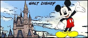
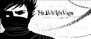
On the other hand, the effect did not work in this sig. There is too much variation on the castle for the contour/bevel/posterization effect to properly work. In the first sig it was nice because it was outlining boundaries of things that may not have been seen otherwise, like the clouds and the boat. In this one the castle is pretty obvious and the poster effect just makes it seem too obvious, if you get what I'm saying.
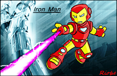
Also, I don't know where the image came from but Micky Mouse is not needed at all. I would have liked to see Tinkerbell, actually, since she can fly and is usually seen hovering around the top of the Disney castle... Unless you had Fantasia Mickey... *remembers Fantasia and smiles*
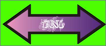
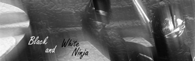
Glad you found some use from the font sites, but try incorporating them into the sig more. UnknownKirbyMan's sig is a good start but the font could have been a bit smaller and maybe followed the line underneath the clouds, and also a little bit more pale, to blend in with the sig instead of being it's own separate thing. Also, don't use the same effect from the sig on the font. It turned out looking pretty bad.
Overall you're progressing a little. Slowly, but that's of no concern. Try using different effects next time. Just one filter at a time is fine, and don't be afraid to spend a few days on it until you think it really looks great. Practice sigs are awesome to make because then you can go crazy and do whatever effects you want and nobody will care. If you happen to make something really awesome then post it! I recommend just messing around with your image program for now though.


