Basically, I've been making sigs and it's become obvious that I can't get the text to complement the image to the extent I want. How should I go about improving this integration? I'm not trying to reach for attention, it's just I've obviously been failing on my own and I wanted some tips to help pick myself back up with.
Also, check my sig out. Psssh.
How should I use text to complement images in sig-making?
-

- Loquacious
- Posts: 1764
- Joined: 2008.09.26 (15:37)
- NUMA Profile: http://nmaps.net/user/Guitar_Hero_Matt
- Location: lacks whiskers of mass destruction.

-

- Spoil-Sport
- Posts: 659
- Joined: 2008.11.02 (23:40)
- NUMA Profile: http://nmaps.net/user/eganic
- MBTI Type: ENFP
i would imagine the style, color, and placement of the text are the key factors.
and so it goes, and so it goes, and so will you soon i suppose.
- Billy Joel
-
- Jedi Pimp
- Posts: 670
- Joined: 2008.09.30 (16:14)
- NUMA Profile: http://nmaps.net/user/toasters
- MBTI Type: ISTP
You can find better examples than this one, but I didn't feel like looking :p
http://img244.imageshack.us/img244/1862 ... sigpn2.png
I liked how the text blended in this one, it's almost hidden but once you see the name it's easily recognizable. Of course there are cases where the text looks better when it stands out more. It really just depends on the image you're making.
http://img244.imageshack.us/img244/1862 ... sigpn2.png
I liked how the text blended in this one, it's almost hidden but once you see the name it's easily recognizable. Of course there are cases where the text looks better when it stands out more. It really just depends on the image you're making.
------------------------------------------------------------
/////////////////////// solar beats ///////////////////////
------------------------------------------------------------
/////////////////////// solar beats ///////////////////////
------------------------------------------------------------
-
- Phei Phei Pho Phum
- Posts: 1456
- Joined: 2008.09.26 (12:28)
- NUMA Profile: http://nmaps.net/user/Pheidippides
- MBTI Type: ISFJ
- Location: New Jersey
I don't think having the text near-hidden is what I would go for, but toasters is definitely right in that it shouldn't draw all the attention from the image. It's supposed to be read, though, so it deserves to be relatively noticeable in my opinion. I'm only a casual sig-maker at best, though. Make of this what you will.

-

- Subterranean Engineer
- Posts: 1694
- Joined: 2008.09.26 (16:15)
- NUMA Profile: http://nmaps.net/user/Izzy
- MBTI Type: INTP
Hidden text? No.
First, you should never ever ever put text in the corner. It's scary.
You should find a matching color, or just use white. Simple fonts are good, such as Arial or Calibri, and they work especially good when they have a dark 2 px stroke and a light gradient overlay.
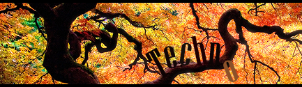
Try to keep your text near the focal, so you're not detracte- You know what, go look at some T3chno sigs.
First, you should never ever ever put text in the corner. It's scary.
You should find a matching color, or just use white. Simple fonts are good, such as Arial or Calibri, and they work especially good when they have a dark 2 px stroke and a light gradient overlay.
Try to keep your text near the focal, so you're not detracte- You know what, go look at some T3chno sigs.

Derived from ksktorngsig!
I don't think the universe has infinite material though, unless God makes DLC packs. - SkyPanda
-
- Loquacious
- Posts: 1764
- Joined: 2008.09.26 (15:37)
- NUMA Profile: http://nmaps.net/user/Guitar_Hero_Matt
- Location: lacks whiskers of mass destruction.
Okay, thanks for the tips. Is my latest sig any progress?
-
- Jedi Pimp
- Posts: 670
- Joined: 2008.09.30 (16:14)
- NUMA Profile: http://nmaps.net/user/toasters
- MBTI Type: ISTP
I'm not too fond of it. First of all you don't have much of a focal, because you have elite that cover the whole sig. Add to that the fact that they're all blurred, and you get an image where the eye is drawn to the one thing you wanted to avoid: the text. IMO the text is still too showy. The color matches well, but it's still too large and obvious. But I think the bigger problem is the lack of a focal. Maybe if you sharpened one of the elites in the center, and then blurred the others you'd get a good sense of depth. But I think it's gonna be hard to make a sig work with that many characters.
..But that's just me :p
..But that's just me :p
------------------------------------------------------------
/////////////////////// solar beats ///////////////////////
------------------------------------------------------------
/////////////////////// solar beats ///////////////////////
------------------------------------------------------------
-
- Loquacious
- Posts: 1764
- Joined: 2008.09.26 (15:37)
- NUMA Profile: http://nmaps.net/user/Guitar_Hero_Matt
- Location: lacks whiskers of mass destruction.
Okay, sounds cool. I tried to do what you said, so here's the result.
Old Sig

New Sig

-

- Moderator

- Posts: 1318
- Joined: 2008.12.04 (01:16)
- NUMA Profile: http://nmaps.net/user/maxson924
- Location: Tampa
- Contact:
I think the new one is definitely better.

-
- Jedi Pimp
- Posts: 670
- Joined: 2008.09.30 (16:14)
- NUMA Profile: http://nmaps.net/user/toasters
- MBTI Type: ISTP
That's a bit better, but that elite in the center still seems unfocused, and the text is too bold still. Maybe it's the quality of your stock?
------------------------------------------------------------
/////////////////////// solar beats ///////////////////////
------------------------------------------------------------
/////////////////////// solar beats ///////////////////////
------------------------------------------------------------
-
- Loquacious
- Posts: 1764
- Joined: 2008.09.26 (15:37)
- NUMA Profile: http://nmaps.net/user/Guitar_Hero_Matt
- Location: lacks whiskers of mass destruction.
Yeah, it could be the stock actually... I've had a go at clearing up the text, which was a simple mistake on my part, actually. I should have just left it in the different layer before sharpening.
New Sig
New New Sig

-
- Subterranean Engineer
- Posts: 1694
- Joined: 2008.09.26 (16:15)
- NUMA Profile: http://nmaps.net/user/Izzy
- MBTI Type: INTP
Well, there's no big difference. I don't like how blurry it is. The sig itself seems blurred for no reason, and I'm not a fan of warped/rotated text anymore.
Derived from ksktorngsig!
I don't think the universe has infinite material though, unless God makes DLC packs. - SkyPanda
-
- Loquacious
- Posts: 1764
- Joined: 2008.09.26 (15:37)
- NUMA Profile: http://nmaps.net/user/Guitar_Hero_Matt
- Location: lacks whiskers of mass destruction.
There wasn't meant to be a massive difference, the only thing I felt needed changing was the text, which I made less prominent, I think. And it's not warped, or at least I don;t think it is. I only used a transparency filter on it, so it shouldn't be warped unless that's part of the focal point. Idk.
-

- Cross-Galactic Train Conducter
- Posts: 2354
- Joined: 2008.09.27 (00:31)
- NUMA Profile: http://nmaps.net/user/T3chno
- MBTI Type: ENTJ
- Location: foam hands
- Contact:
http://www.dafont.com
Go there.
Get some.
Place it near the focal.
Blend (smudge, erase, displace, etc.)
Upload
Go there.
Get some.
Place it near the focal.
Blend (smudge, erase, displace, etc.)
Upload
-

- Depressing
- Posts: 1989
- Joined: 2008.09.28 (01:10)
- NUMA Profile: http://nmaps.net/user/UniverseZero
- Steam: www.steamcommunity.com/id/universezero/
- MBTI Type: ENTJ
- Location: The City of Sails, The Land of the Long White Cloud
- Contact:
That's about it.Techno wrote:http://www.dafont.com
Go there.
Get some.
Place it near the focal.
Blend (smudge, erase, displace, etc.)
Upload
Also, in blending, transparency is always good, which I see you're doing.
-

- Unsavory Conquistador of the Western Front
- Posts: 1568
- Joined: 2008.09.26 (05:54)
- NUMA Profile: http://www.nmaps.net/user/origami_alligator
- MBTI Type: ENTP
- Location: Portland, Oregon
There is no set way to blend text. It's just something you have to practice and experiment and not be afraid to fail at one million times over.
You would like advice though?
Download many fonts, make many images, and try your hardest to keep the text from being exactly horizontal or vertical (unless it looks best that way in the sig) and try experimenting with moving your text to odd places and warping it and skewing it and rotating it and giving it different layer modes and then changing the opacity and the color and everything you can think of.
Once you have discovered all the different things you can do with text and become proficient with them you'll be able to put text into an image almost anywhere and make it look good.
.,,,,,@
"Listening intently, the thoughts linger ever vibrant. Imagine knowledge intertwined, nostalgiacally guiding/embracing."
<Kaglaxyclax> >>> southpaw has earned the achievement "Heartbreaker".
Promoted to the rank of Ultimate Four by LittleViking
[15:34] <Brttrx> ADDICTION IS GOOD, MR BAD INFLUENCE
[20:05] <southpaw> 8:05pm, Wednesday, 29 April, 2009, southpaw completed N.
[22:49] <makinero> is it orange-orange-gold yellow gold silverthread forest urban chic orange-gold?
-
- Loquacious
- Posts: 1764
- Joined: 2008.09.26 (15:37)
- NUMA Profile: http://nmaps.net/user/Guitar_Hero_Matt
- Location: lacks whiskers of mass destruction.
Okay, thanks for the advice. I didn't want a massive guide per-sé, vjust wanted some pointers to help me discover on my own. But thanks, that's been really helpful. I'll try and incorporate a lot of new stuff in my imagework from now on.
-
- Loquacious
- Posts: 1764
- Joined: 2008.09.26 (15:37)
- NUMA Profile: http://nmaps.net/user/Guitar_Hero_Matt
- Location: lacks whiskers of mass destruction.
Okay, I've had another go, mostly using the same stuff but on a different stock. How does it compare? Also, do you prefer the large or small version? (i.e., 500x150 or 500x120)


-
- The 700 Club
- Posts: 732
- Joined: 2008.11.19 (00:59)
- NUMA Profile: http://nmaps.net/user/greenblack
- Location: In the land of the jabberwocky
ze small has easier and better text
-

- The number of seats in an Airbus A380
- Posts: 557
- Joined: 2008.09.26 (08:29)
- NUMA Profile: http://nmaps.net/user/Eiturlyf
- MBTI Type: ISFP
- Location: Iceland!
That text is too plain.

Die Kreatur muss sterben!
-
- Can the real Dave Simpson please stand up? Sit down, Grant.
- Posts: 149
- Joined: 2008.09.30 (22:38)
I wasn't sure about where to put the text in mine, I think any other place wouldn't have worked though.
-
- Loquacious
- Posts: 1764
- Joined: 2008.09.26 (15:37)
- NUMA Profile: http://nmaps.net/user/Guitar_Hero_Matt
- Location: lacks whiskers of mass destruction.
Okay, screw those two sigs, this is the favorite sig I've ever made. What does everyone think? I know it's more of the same already, so don't tell me.

-
- Subterranean Engineer
- Posts: 1694
- Joined: 2008.09.26 (16:15)
- NUMA Profile: http://nmaps.net/user/Izzy
- MBTI Type: INTP
The text doesn't blend well, see how the gun is blurred in the same spot the text is? Looks like you tried to force depth and the dude could be blended a bit more on the left.
Bottom lightsource seems off.
At least the text isn't in the corner.
Bottom lightsource seems off.
At least the text isn't in the corner.
Derived from ksktorngsig!
I don't think the universe has infinite material though, unless God makes DLC packs. - SkyPanda
-
- Unsavory Conquistador of the Western Front
- Posts: 1568
- Joined: 2008.09.26 (05:54)
- NUMA Profile: http://www.nmaps.net/user/origami_alligator
- MBTI Type: ENTP
- Location: Portland, Oregon
Make the text white (or some bright color), smaller (maybe down to 10pt?) and then place it on the blurred out area of the shotgun and blur the text slightly for blending.
That's how one places text. In areas where you wouldn't think to put it, yet still aesthetically pleasing.
That's how one places text. In areas where you wouldn't think to put it, yet still aesthetically pleasing.
.,,,,,@
"Listening intently, the thoughts linger ever vibrant. Imagine knowledge intertwined, nostalgiacally guiding/embracing."
<Kaglaxyclax> >>> southpaw has earned the achievement "Heartbreaker".
Promoted to the rank of Ultimate Four by LittleViking
[15:34] <Brttrx> ADDICTION IS GOOD, MR BAD INFLUENCE
[20:05] <southpaw> 8:05pm, Wednesday, 29 April, 2009, southpaw completed N.
[22:49] <makinero> is it orange-orange-gold yellow gold silverthread forest urban chic orange-gold?
-
- Cross-Galactic Train Conducter
- Posts: 2354
- Joined: 2008.09.27 (00:31)
- NUMA Profile: http://nmaps.net/user/T3chno
- MBTI Type: ENTJ
- Location: foam hands
- Contact:
Get a new font. Now. Just tilting plain text does not make it fit.
Who is online
Users browsing this forum: No registered users and 10 guests