maestro's forum skin

Share and discuss your images, image-editing techniques, and artworks.
User avatar
La historia me absolverá
Posts: 2228
Joined: 2008.09.19 (14:27)
NUMA Profile: http://nmaps.net/user/maestro
MBTI Type: INTP
Location: Beijing
Contact:

Postby 乳头的早餐谷物 » 2009.01.07 (12:27)

These Photoshop examples are a little hasty and incomplete but you can see what I'm going for. I am yet to work out what I want to do with all the links at the top, and there's plenty of other things that aren't properly included. I'd probably add the missing elements straight to an HTML/CSS mockup instead of worrying about adding more to this.

Index:

Image

Topic:

Image

Comments and suggestions welcome, bearing in mind my disclaimer. Also, we wouldn't really have that many otter forums. 2 or 3, max.
M E A T N E T 1 9 9 2

Image

User avatar
Subterranean Engineer
Posts: 1694
Joined: 2008.09.26 (16:15)
NUMA Profile: http://nmaps.net/user/Izzy
MBTI Type: INTP

Postby Izzy » 2009.01.07 (12:34)

I like it. The colors are good and very `stro-ish, but I'd really like to see the Metanet logo somewhere..
Image
Derived from ksktorngsig!
I don't think the universe has infinite material though, unless God makes DLC packs. - SkyPanda

Plus (Size) Member
Posts: 46
Joined: 2008.09.26 (08:19)
NUMA Profile: http://nmaps.net/user/
Location: Brisbane
Contact:

Postby Pembie » 2009.01.07 (12:57)

I actually really like that, but maybe not in red. That's about the only thing I don't like, maybe a green or blue, but that's a simple CSS change in the end.

User avatar
Depressing
Posts: 1977
Joined: 2008.09.26 (06:46)
NUMA Profile: http://nmaps.net/user/rennaT
MBTI Type: ISTJ
Location: Trenton, Ontario, Canada
Contact:

Postby Tanner » 2009.01.07 (13:10)

I like it. I'd use this.
Image
'rret donc d'niaser 'vec mon sirop d'erable, calis, si j't'r'vois icitte j'pellerais la police, tu l'veras l'criss de poutine de cul t'auras en prison, tabarnak

User avatar
Average Time to Take Breakfast in Equador
Posts: 640
Joined: 2008.09.27 (03:11)
NUMA Profile: http://nmaps.net/user/geti
MBTI Type: ENFJ
Contact:

Postby Geti » 2009.01.07 (13:12)

this is what forums should be like. stylish and minimal, but like a shot from a pro desk-modders album at the same time.
b-e-a-utiful.
spoiler

"I'd be happy for a lion if it hunted me down and ate me, but not so happy for it if it locked up me and my family, then forced us to breed so it may devour our offspring." - entwilight <3
How do you know that God didn't intend for humans to be the animals' caretakers? He might be appalled that He gave us these animals to use and we're fucking eating them. - Tsukatu
4th - DDA Speedrunning Contest.
One Hundred Percent Vegetarian

deviantArt Profile - 1BarDesign
God knows if i'm back.

Global Mod
Global Mod
Posts: 1596
Joined: 2008.09.26 (13:10)
NUMA Profile: http://nmaps.net/user/gloomp
MBTI Type: INTP
Location: Troy, New York
Contact:

Postby unoriginal name » 2009.01.07 (15:34)

You know I love this.

User avatar
Cowboy Magician
Posts: 510
Joined: 2008.09.23 (13:07)
NUMA Profile: http://nmaps.net/user/wedgie123
MBTI Type: ENTJ
Location: Essex, England

Postby wedgie » 2009.01.07 (18:37)

Change the top left m for the metanet M and you can have my signature of approval.

User avatar
Diagnosis Mohawk: Bahrain Cock Theory
Posts: 1405
Joined: 2008.09.23 (13:25)
NUMA Profile: http://nmaps.net/user/spawn_of_yanni
MBTI Type: ENFJ
Location: Pittsburgh

Postby Spawn of Yanni » 2009.01.07 (18:49)

I love this. Except I was never into periods after things like "Metanet Forums".
Image
feline disrespect from behind

User avatar
Cowboy Magician
Posts: 510
Joined: 2008.09.23 (13:07)
NUMA Profile: http://nmaps.net/user/wedgie123
MBTI Type: ENTJ
Location: Essex, England

Postby wedgie » 2009.01.07 (19:35)

What?

I also disagree with Pembie on this. I love red, so it's nice having some red in a design, instead of always, always going for blue or occasionally green.

User avatar
Loquacious
Posts: 1764
Joined: 2008.09.26 (15:37)
NUMA Profile: http://nmaps.net/user/Guitar_Hero_Matt
Location: lacks whiskers of mass destruction.

Postby MattKestrel » 2009.01.07 (20:53)

wedgie wrote:Change the top left m for the metanet M and you can have my signature of approval.
QFE.

Also, slightly darker shade of red imo, like this but not as purple and it's a winner.
Image

User avatar
Odd
Posts: 1374
Joined: 2008.09.27 (14:03)
NUMA Profile: http://nmaps.net/user/pni
MBTI Type: ENFP
Location: Ottawa
Contact:

Postby Pixon » 2009.01.07 (21:38)

Very 'stro-esque. The only thing that I don't like about this is that the Users Online thing is on the left. I sort of like it at the bottom.
spoiler

Signatures supplied by the following: NicNac14, Tsukatu, aphex_n, Nphasis, pinkymyno1, UniverseZero, gloomp, sidke, 29403, AMomentLikeThis, Chase, Red Reamer, Izzy, MyCheezKilledYours, Techno, Donfuy juice, southpaw, IAMAMAZING, SkyRay, Skyline, Why_Me, jackass, Leaff, esay, Daikenkai, Kablamo_Boom, wumbla, Izzy, toasters, Octopod Squad, behappyy, notsteve, Shadowraith, GTM, Animator, kkstrong, TearsOfTheSaints, Spawn of Yanni, nnn, Furry Ant, ampburner, fawk. Thanks.
I have 72 signatures.

I accept signature donations.

User avatar
Lifer
Posts: 1066
Joined: 2008.09.26 (18:37)
NUMA Profile: http://nmaps.net/user/EdoI
MBTI Type: INTJ
Location: Zenica, Bosnia and Herzegovina

Postby EdoI » 2009.01.07 (21:39)

This is going to be one awesome skin! I love stuff placement on the left side, I like that there will finally be some N links (you forgot therealn.com), message titles will be noticeable... But I will agree with wedgie that you should change -M, and I also agree with Yanni that THERE SHALL BE NO PERIODS IN TITLES! I like the red color and I wouldn't change it. Since we're going to have three (or four) new skins, I'm going to switch to next skin every day! BTW I'm starting to like Hermes... a lot...

User avatar
Bayking
Posts: 318
Joined: 2008.09.27 (19:36)

Postby Animator » 2009.01.07 (23:29)

I like it, but the M in the corner has an odd reminder of McDonald's for me.

But still, Ba-da-ba-ba-ba, I'm lovin' it.
Image

User avatar
Cross-Galactic Train Conducter
Posts: 2354
Joined: 2008.09.27 (00:31)
NUMA Profile: http://nmaps.net/user/T3chno
MBTI Type: ENTJ
Location: foam hands
Contact:

Postby T3chno » 2009.01.07 (23:53)

I love this. Probably the most usable one I can see so far. It's fresh, new, and awesome.
Image

User avatar
Hawaii Five-Oh
Posts: 921
Joined: 2008.09.26 (05:49)
NUMA Profile: http://nmaps.net/user/condog_111
MBTI Type: ISTJ
Location: Melbourne-ish

Postby Condog » 2009.01.08 (00:51)

Oh man, that is a damn fine skin maestro. The only problems i have are the ones that everyone else has already address - the metanet 'M' and maybe trying out blue instead of red. Definitely my favourite skin so far. Great work.
Image

Ice Climbers are awesome. Deal with it.

User avatar
Dance Dance Revolution Android
Posts: 881
Joined: 2008.09.28 (02:06)
NUMA Profile: http://nmaps.net/user/TribulatioN
MBTI Type: ESFP
Location: Canada

Postby TribulatioN » 2009.01.08 (01:09)

Condog wrote:Oh man, that is a damn fine skin maestro. The only problems i have are the ones that everyone else has already address - the metanet 'M' and maybe trying out blue instead of red. Definitely my favourite skin so far. Great work.
My critiques were already mentioned as well.
I like the red, but the simplicity of this skin could make both easily doable.

This skin is really great, thumbs up from me.
[ispoiler=http://i31.tinypic.com/111p9bo.png]gloomp : gloomp : Why Me : toasters : SkyRay : Slurpee@fpsbanana : KaMikA@Haklabs[/ispoiler]ImageImage[spoiler=Neditor Nation]Currently Challenging: lord_day
Image[/spoiler][spoiler=Puzzle of the Exuberant!]
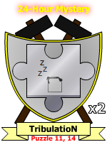
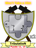
Image
Image
ImageImageImageImageImage[/spoiler]

User avatar
The Konami Number
Posts: 586
Joined: 2008.09.19 (12:27)
NUMA Profile: http://nmaps.net/user/Atilla

Postby Atilla » 2009.01.08 (01:49)

I really like this one, though I would prefer a different colour.

User avatar
The 700 Club
Posts: 743
Joined: 2008.09.30 (07:37)
NUMA Profile: http://nmaps.net/user/jackass77
MBTI Type: ESFJ
Location: Australia

Postby jackass » 2009.01.08 (02:37)

My Favourite Of Them All ,,, Simple And User FriendlyBy the Looks of it :D Keep the Red
[align=center]Image
Mine :: Techno :: Incluye :: GTM ::Skyline :: Riobe :: GTM 2[/align]

User avatar
Cowboy Magician
Posts: 510
Joined: 2008.09.23 (13:07)
NUMA Profile: http://nmaps.net/user/wedgie123
MBTI Type: ENTJ
Location: Essex, England

Postby wedgie » 2009.01.08 (03:20)

In hindsight, this is easily my most favourite skin out of the lot by far. I really like it.

I would personally go a lot darker like the pic below, though your skin is light and clean, so I don't think you can go too dark with it.
Attachments
fo1.PNG
(7.92 KiB) Downloaded 521 times

Yes sir, no sir, three bags full sir
Posts: 1561
Joined: 2008.09.26 (12:33)
NUMA Profile: http://nmaps.net/user/incluye
MBTI Type: ENTP
Location: USofA
Contact:

Postby otters » 2009.01.08 (04:43)

Very good. I must say, extremely good.
Image

User avatar
Beyond a Perfect Math Score
Posts: 834
Joined: 2008.09.30 (06:37)
NUMA Profile: http://nmaps.net/user/Nexx
MBTI Type: INTJ
Location: California, USA

Postby Nexx » 2009.01.08 (08:18)

Looks great! Really nice work.

User avatar
La historia me absolverá
Posts: 2228
Joined: 2008.09.19 (14:27)
NUMA Profile: http://nmaps.net/user/maestro
MBTI Type: INTP
Location: Beijing
Contact:

Postby 乳头的早餐谷物 » 2009.01.08 (10:50)

Thanks for the comments! I like the red, but I'll be sure to set it up so that changing the colour is just a simple CSS change, like Pembie said. The Metanet M certainly can go into the logo, full stop removed, whatever else. (The current M does look McDonald's-ish, perhaps because I had been looking at international McDonald's websites while making this.)

I guess I'll get working on the next phase of the design.
M E A T N E T 1 9 9 2

Image

User avatar
Mr. Glass
Posts: 2019
Joined: 2008.09.27 (20:22)
NUMA Profile: http://nmaps.net/user/astheoceansblue
MBTI Type: ENTP
Location: up down left right start A start

Postby a happy song » 2009.01.08 (13:35)

The only criticism I have is that the thing seems a little too loose. Needs some more cohesion between areas/topics/etc..

Otherwise, the direction is quite unique and the colours are great!
click sig :::
spoiler


n
::: astheoceansblue
::: My eight episode map pack: SUNSHINEscience
::: Map Theory: The Importance of Function & Form

-
M U S I C
::: The forest and the fire: myspace
::: EP available for FREE download, here.

-
A R T
::: Sig & Avatar Artwork by me - see here!

-
G A M I N G
::: Steam ID: 0:1:20950734
::: Steam Username: brighter


User avatar
Lifer
Posts: 1066
Joined: 2008.09.26 (18:37)
NUMA Profile: http://nmaps.net/user/EdoI
MBTI Type: INTJ
Location: Zenica, Bosnia and Herzegovina

Postby EdoI » 2009.01.08 (15:12)

maestro wrote:Thanks for the comments! I like the red, but I'll be sure to set it up so that changing the colour is just a simple CSS change, like Pembie said.
So it won't be red anymore? Nooooo.....

Yes sir, no sir, three bags full sir
Posts: 1561
Joined: 2008.09.26 (12:33)
NUMA Profile: http://nmaps.net/user/incluye
MBTI Type: ENTP
Location: USofA
Contact:

Postby otters » 2009.01.08 (16:28)

EdoI wrote:
maestro wrote:Thanks for the comments! I like the red, but I'll be sure to set it up so that changing the colour is just a simple CSS change, like Pembie said.
So it won't be red anymore? Nooooo.....
Go read that again.
atob wrote:The only criticism I have is that the thing seems a little too loose. Needs some more cohesion between areas/topics/etc..
I dunno. I think it fits together very, very well. Especially with putting the member info in the sidebar...genius, I say.
Image


Who is online

Users browsing this forum: No registered users and 12 guests