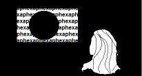
I made a new N+ BG because I liked the game alot. It took about 2 minutes to make the entire thing but I still put in a lot of effort in those 2 minutes. I am looking for feedback on how well it came out. any comments?
I'd like it if one of the N+ creators commented on this image.
BTW you have to click on it or it look terrible.
feed back for N+ tribute image
-
- dreams slip through our fingers like hott slut sexxx
- Posts: 3896
- Joined: 2009.01.14 (15:41)
- NUMA Profile: http://nmaps.net/user/Tunco123
- MBTI Type: INTJ
- Location: Istanbul
Write it in bold.ddrmaxman wrote: BTW you have to click on it or it look terrible.
Anyway, nice, but you can make the text smaller, with a different font.
Otherwise, I liked it.


-
- Tetris
- Posts: 4
- Joined: 2009.06.13 (08:29)
Tunco123 wrote:Write it in bold.ddrmaxman wrote: BTW you have to click on it or it look terrible.
Anyway, nice, but you can make the text smaller, with a different font.
Otherwise, I liked it.
What font would you suggest?
-
- RoboBarber
- Posts: 361
- Joined: 2009.04.17 (09:55)
- NUMA Profile: http://nmaps.net/user/Aphex_N
- MBTI Type: ENFJ
- Location: Arstar
my honest opinion is that its ok, but its nothing special or eyecatching.
i don't know though, because N is all about minimalism, so this is quite fitting, in the sense it is minamalist in style.
In terms of improvements im not sure... For N fanart its good, in terms of general image making, its not impressive.
But thats just my opnion ^^
i don't know though, because N is all about minimalism, so this is quite fitting, in the sense it is minamalist in style.
In terms of improvements im not sure... For N fanart its good, in terms of general image making, its not impressive.
But thats just my opnion ^^
-
- Tetris
- Posts: 4
- Joined: 2009.06.13 (08:29)
well at least I got the minimalist thing right.Aphex wrote:my honest opinion is that its ok, but its nothing special or eyecatching.
i don't know though, because N is all about minimalism, so this is quite fitting, in the sense it is minamalist in style.
In terms of improvements im not sure... For N fanart its good, in terms of general image making, its not impressive.
But thats just my opnion ^^
-

- Schlock Schtock and Two Schmoking Barrels
- Posts: 814
- Joined: 2008.09.26 (13:24)
- NUMA Profile: http://nmaps.net/user/chase16/
- MBTI Type: ISFJ
- Location: United Kingdom
- Contact:
Make it bigger, wallpaper size. Then I'd think it was amazing.

-
- Lifer
- Posts: 1066
- Joined: 2008.09.26 (18:37)
- NUMA Profile: http://nmaps.net/user/EdoI
- MBTI Type: INTJ
- Location: Zenica, Bosnia and Herzegovina
Make the ninja's borders smoother, and wallpaper size.
-
- dreams slip through our fingers like hott slut sexxx
- Posts: 3896
- Joined: 2009.01.14 (15:41)
- NUMA Profile: http://nmaps.net/user/Tunco123
- MBTI Type: INTJ
- Location: Istanbul
I just can't say the font, but find something that is neat, catchy, and makes text look more on background.ddrmaxman wrote:Tunco123 wrote:Write it in bold.ddrmaxman wrote: BTW you have to click on it or it look terrible.
Anyway, nice, but you can make the text smaller, with a different font.
Otherwise, I liked it.
What font would you suggest?
-
- RoboBarber
- Posts: 361
- Joined: 2009.04.17 (09:55)
- NUMA Profile: http://nmaps.net/user/Aphex_N
- MBTI Type: ENFJ
- Location: Arstar
Its just my opinion, ddrmaxman, sorry if i sounded mean. I like my images to be complex, so my advice is probably not suitable for this, although, i have had a few ideas, but these are just ideas, the image is good as it is :)
if your using photoshop:
try duplicating the layer with the ninja, adding the filter distort>ripple then setting the layer to overlay, and set the opacity to 40%. Then create another duplicate layer of the original ninja, and merge it with a duplicate of the text, then use gaussian blur, with 2.5, then set the opacity to 80%. Repeat the last step, with gaussian blr set to 6, and opacity 60%. Then duplicate the original nija layer, and add motion blur going horizontal, then set the layer to opacity 60%
I think that would look quite cool. In terms of general hints add some complexity to the glow around the ninja, and do some smudging of the red head band. If the text was a little more in the background, that would make it better too.
-

- Cross-Galactic Train Conducter
- Posts: 2354
- Joined: 2008.09.27 (00:31)
- NUMA Profile: http://nmaps.net/user/T3chno
- MBTI Type: ENTJ
- Location: foam hands
- Contact:
It's a little boring. Nothing goin' on. :/ Try using some other effect than outer glow.
Who is online
Users browsing this forum: No registered users and 4 guests