Donfuy proposes this skin.

Share and discuss your images, image-editing techniques, and artworks.
User avatar
Antonio Banderas
Posts: 1703
Joined: 2008.09.26 (13:56)
NUMA Profile: http://nmaps.net/user/donfuy
MBTI Type: ISTP
Location: port

Postby Donfuy » 2009.01.10 (00:08)

Ok. This is a unfinished proposal of a a possible skin of the forum. I'll add what's missing later, if I see there's some interest in the main concept.

What's missing:
-Topic Icons
-NUMA and Metanet Software links (NUMA's there, but I'm still thinking where's the best place to put it
-Users online zone
-Birthdays
-And some things like "View unanswered posts" or "Mark all forums as read"


Image

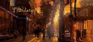
I really want some criticism, probably more in the colors and if those gradients in the upper part work well.
Image

User avatar
Dance Dance Revolution Android
Posts: 881
Joined: 2008.09.28 (02:06)
NUMA Profile: http://nmaps.net/user/TribulatioN
MBTI Type: ESFP
Location: Canada

Postby TribulatioN » 2009.01.10 (00:17)

I like the geometry behind it.
I not a fan of the blue gradients, as it creates a very cold mood.
The translucent forums part is a bit hard to see as well.
But other than that, I like everything else especially the simplicity.
[ispoiler=http://i31.tinypic.com/111p9bo.png]gloomp : gloomp : Why Me : toasters : SkyRay : Slurpee@fpsbanana : KaMikA@Haklabs[/ispoiler]ImageImage[spoiler=Neditor Nation]Currently Challenging: lord_day
Image[/spoiler][spoiler=Puzzle of the Exuberant!]Image
Image
ImageImageImageImageImage[/spoiler]

User avatar
Admin
Admin
Posts: 2332
Joined: 2008.09.27 (16:53)
NUMA Profile: http://www.nmaps.net/user/Aidiera :3
Steam: www.steamcommunity.com/id/
MBTI Type: INTJ
Location: Phoenix, Arizona

Postby aids » 2009.01.10 (01:08)

BE_nSPIRED wrote:the background hurts my eyes, keep going
yes try a higher opacity? you know, less see-through.
Image

//--^.^--\\
\\.:.^.:.//

User avatar
Mr. Glass
Posts: 2019
Joined: 2008.09.27 (20:22)
NUMA Profile: http://nmaps.net/user/astheoceansblue
MBTI Type: ENTP
Location: up down left right start A start

Postby a happy song » 2009.01.10 (01:11)

Hurts to look at like they said.
click sig :::
spoiler


n
::: astheoceansblue
::: My eight episode map pack: SUNSHINEscience
::: Map Theory: The Importance of Function & Form

-
M U S I C
::: The forest and the fire: myspace
::: EP available for FREE download, here.

-
A R T
::: Sig & Avatar Artwork by me - see here!

-
G A M I N G
::: Steam ID: 0:1:20950734
::: Steam Username: brighter


User avatar
The Konami Number
Posts: 586
Joined: 2008.09.19 (12:27)
NUMA Profile: http://nmaps.net/user/Atilla

Postby Atilla » 2009.01.10 (01:34)

I echo the cries of "The background causes eye strain". And I don't like the gradient, either.

User avatar
Intel 80486
Posts: 488
Joined: 2008.09.29 (04:14)
NUMA Profile: http://nmaps.net/user/epigone
Location: Iowa

Postby epigone » 2009.01.10 (01:40)

MY EYES!!!
Member of the Metanet Forum community since June 3rd, 2006.


The Best of Epigone

User avatar
Antonio Banderas
Posts: 1703
Joined: 2008.09.26 (13:56)
NUMA Profile: http://nmaps.net/user/donfuy
MBTI Type: ISTP
Location: port

Postby Donfuy » 2009.01.10 (01:41)

Mmm... with more opacity (like Life247 said), it's much more easier to see. Hope you like it this way.
Image
Atilla wrote:And I don't like the gradient, either.
I'm now working on another form there.


EDIT: the topic space is way too big, I know.
Image

User avatar
Antonio Banderas
Posts: 1703
Joined: 2008.09.26 (13:56)
NUMA Profile: http://nmaps.net/user/donfuy
MBTI Type: ISTP
Location: port

Postby Donfuy » 2009.01.10 (02:21)

Image

Well, another version of the upper part.
BE_nSPIRED wrote:i find it really difficult to see the writing, the black on the background fuses with the black on the foreground to make bad reading. also the reason my eyes hurt is because of the sharpness of the tiles in the background, a gaussia blur wouldnt go amis
Ahum, the sharpness is needed to the effect. Well, I can read really well now, don't have any problems reading it.


Anyway BE_nSPIRED, I'll do a little bit of blur onto the mosaics, to see how it looks.
Image

User avatar
Cross-Galactic Train Conducter
Posts: 2354
Joined: 2008.09.27 (00:31)
NUMA Profile: http://nmaps.net/user/T3chno
MBTI Type: ENTJ
Location: foam hands
Contact:

Postby T3chno » 2009.01.10 (02:50)

Hmm. Is the background a pattern? It looks as if it isn't. That's gonna be one large picture to load.
Image

User avatar
Antonio Banderas
Posts: 1703
Joined: 2008.09.26 (13:56)
NUMA Profile: http://nmaps.net/user/donfuy
MBTI Type: ISTP
Location: port

Postby Donfuy » 2009.01.10 (02:55)

It isn't a pattern. But if it gets accepted, I'll do a pattern instead of this image.
Image

User avatar
Intel 80486
Posts: 488
Joined: 2008.09.29 (04:14)
NUMA Profile: http://nmaps.net/user/epigone
Location: Iowa

Postby epigone » 2009.01.10 (04:10)

The boxes with text would be better if they were just one solid color.
Member of the Metanet Forum community since June 3rd, 2006.


The Best of Epigone

User avatar
Antonio Banderas
Posts: 1703
Joined: 2008.09.26 (13:56)
NUMA Profile: http://nmaps.net/user/donfuy
MBTI Type: ISTP
Location: port

Postby Donfuy » 2009.01.10 (04:39)

Image

Here it is. Looks better.


Working on the icons now.
Image

User avatar
Dance Dance Revolution Android
Posts: 881
Joined: 2008.09.28 (02:06)
NUMA Profile: http://nmaps.net/user/TribulatioN
MBTI Type: ESFP
Location: Canada

Postby TribulatioN » 2009.01.10 (04:44)

It's getting better, but I don't like the text boxes being totally grey. At least make it two-toned.
[ispoiler=http://i31.tinypic.com/111p9bo.png]gloomp : gloomp : Why Me : toasters : SkyRay : Slurpee@fpsbanana : KaMikA@Haklabs[/ispoiler]ImageImage[spoiler=Neditor Nation]Currently Challenging: lord_day
Image[/spoiler][spoiler=Puzzle of the Exuberant!]Image
Image
ImageImageImageImageImage[/spoiler]

User avatar
Bayking
Posts: 315
Joined: 2008.10.01 (20:26)
NUMA Profile: http://nmaps.net/user/exuberance
Location: Guelph, Ontario, Canada

Postby Exüberance » 2009.01.10 (05:06)

I just don't like the quasi-checkerboard background. Draws attention away from everything else. I tend to drift towards the checkerboard instead of the box (in all versions)
ExüberNewsFeed: Exuberance is mostly <AFF> (Away From Forums) for a while, though I may still participate in epic contests/threads. When I return, I shall bring several comic updates (enough to finish season 1) and hopefully 1 or 2 games- at least one of which is N-related
Comic Activity-O-Meter: (how often I'm updating my comic)
(Click here to see what each level and half-level means in terms of updates per time period)

NOTE: If I just add a bunch of comics in one day, but plan on going back to normal after that, I probably won't update the status.
+ Dead: Canceled. Done. Maybe you'll get a random comic like once a year, but it's pretty much done.
- Zombie (Dead/Comatose): The comic is probably done regular updates forever, but I'll probably still add something once in a blue moon. It's still POSSIBLE, that I'll raise the status up, but not very likely. Maybe I'll have a comicplosion for like a week, then go back to being dead
+ Comatose: Complete stand-by. No (or very few) updates for some amount of time, but the comic's far from being over
- <AFK> (Comatose/Loitering): Stand-by, but you might possibly count on a few updates once and a while. Again, this is temporary
+ Loitering: Like comatose, but for short amount of times.
- Turtling (Loitering/Semi-Active): Really slooooww updates
+ Semi-Active: One every 2 weeks...ish?
- Quasi-Active (Semi-Active/Active): Averaging about 2 comics every 3 weeks
+ Active: Loosely defined status, but about a weekly update
- Over-Active (Active/Power-leveling): About 2 comics a week
+ Power-leveling: About 3 comics a week. Possible a schedule, possibly not
- Über-Epic (Power-leveling/COMICPLOSION!!): In some cases, this may actually be mean updates more frequently than COMICPLOSION!!, but I'm defining this level as a non-organized comic rush, kind of like a few days after my comic started
+ COMICPLOSION!!: Daily updates for a minimum of 5 days (since the daily updates started. It remains at this status until the 5, 7, whatever days are done)

Image
"Science without religion is lame. Religion without science is blind." ~Albert Einstein
My N+ Vector Sprite Sheet ::: My Caption Contest ::: My Comic :::Puzzles of the Exuberant ::: DEFEND YOUR NINJA: THE FLASH GAME (Release Date TBA)
Image
Exüberance on WoW
Image
Maps in the Fernat Epic (so far): (meh, let's put this in a spoiler too. My sig's gettin too big. I'm such a packrat :p)

Nmaps.netNmaps.net


User avatar
Lifer
Posts: 1066
Joined: 2008.09.26 (18:37)
NUMA Profile: http://nmaps.net/user/EdoI
MBTI Type: INTJ
Location: Zenica, Bosnia and Herzegovina

Postby EdoI » 2009.01.10 (10:32)

You didn't totally delete that NUMA link that was down right. And I liked that blurry message background more.

User avatar
The Konami Number
Posts: 586
Joined: 2008.09.19 (12:27)
NUMA Profile: http://nmaps.net/user/Atilla

Postby Atilla » 2009.01.10 (13:07)

I still don't like it. I think I like that header even less than the gradient, mostly because the dingy grey colour doesn't contrast properly with the text. Also, I agree with Exüberance about the background.

User avatar
Lifer
Posts: 1066
Joined: 2008.09.26 (18:37)
NUMA Profile: http://nmaps.net/user/EdoI
MBTI Type: INTJ
Location: Zenica, Bosnia and Herzegovina

Postby EdoI » 2009.01.10 (15:53)

Exüberance wrote:I just don't like the quasi-checkerboard background.
I think it's apsolutely 0K. Beside that, it will get covered by the forums. In global, very nice skin.

User avatar
Antonio Banderas
Posts: 1703
Joined: 2008.09.26 (13:56)
NUMA Profile: http://nmaps.net/user/donfuy
MBTI Type: ISTP
Location: port

Postby Donfuy » 2009.01.10 (15:59)

Uhm, the background is the heart of the skin, so if I remove it, I would be killing it.

Really, I never thought there was going to be this kind of problems like the distracting background. To me and to some other persons I know who see sites everyday, it looks cool.


Meh, I'll just finish this one (put just a tiny bit of transparency on the boxes, to integrate more with the rest of the skin and finish some tiny stuff) and do another skin then, as it doesn't amuse most people here.
Image

User avatar
Lifer
Posts: 1066
Joined: 2008.09.26 (18:37)
NUMA Profile: http://nmaps.net/user/EdoI
MBTI Type: INTJ
Location: Zenica, Bosnia and Herzegovina

Postby EdoI » 2009.01.10 (16:17)

Donfuy wrote:Uhm, the background is the heart of the skin, so if I remove it, I would be killing it.

Really, I never thought there was going to be this kind of problems like the distracting background. To me and to some other persons I know who see sites everyday, it looks cool.


Meh, I'll just finish this one (put just a tiny bit of transparency on the boxes, to integrate more with the rest of the skin and finish some tiny stuff) and do another skin then, as it doesn't amuse most people here.
I completely agree. Every skin has something that makes it different from others. Yeah, it's very cool. You have made an awful mistake putting it here before it's done. It would be better if you were doing it alone. That way you would never get such radical proposals as changing background. If you waited for it to be done, no one would have any change this; change that stuff. Beside that - no one is forced to use it, but I definitely will. Only don't forget to remove those two lines down right. And please, don't show us any progress anymore. Wait till you finish it.

User avatar
Remembering Hoxygen
Posts: 972
Joined: 2008.11.02 (06:13)
NUMA Profile: http://nmaps.net/user/rikaninja
Location: The darkness beyond hell.

Postby Rikaninja » 2009.01.11 (04:18)

The checkers seem to stamnd out to much. Maybe di it down a bit. You surely don't wan't that to be the main reason of the skin. New image would be a good idea as said before.
Image

Yes sir, no sir, three bags full sir
Posts: 1561
Joined: 2008.09.26 (12:33)
NUMA Profile: http://nmaps.net/user/incluye
MBTI Type: ENTP
Location: USofA
Contact:

Postby otters » 2009.01.11 (04:19)

Too dark and extremely boring. Add some noise, some flair, some pizzazz. Like gradients. Yeah. I like gradients.
Image

User avatar
Remembering Hoxygen
Posts: 972
Joined: 2008.11.02 (06:13)
NUMA Profile: http://nmaps.net/user/rikaninja
Location: The darkness beyond hell.

Postby Rikaninja » 2009.01.11 (04:27)

Now that you mention it does seem a little dark. Maybe experiment on some new colours. You seem a bit stuck in one place wtrying to keep with a theme. But seriously, chill. Go with the flow. Unless that's the flow :?
Image

User avatar
Moderator
Moderator
Posts: 941
Joined: 2008.09.29 (04:32)
NUMA Profile: http://nmaps.net/user/PALEMOON Bad Thread
MBTI Type: ISTP

Postby PALEMOON » 2009.01.11 (04:29)

NOT DARK ENOUGH.

where are the bats, the lightningrods? i want to see a little more black filigree, here.


edit: there are SKIN threads everywhere so feedback gets boring unless you MIX
IT
UP

User avatar
Remembering Hoxygen
Posts: 972
Joined: 2008.11.02 (06:13)
NUMA Profile: http://nmaps.net/user/rikaninja
Location: The darkness beyond hell.

Postby Rikaninja » 2009.01.11 (05:04)

LOLOLOL.
Some time a question myself what I am doing here when I here posts like that. ROFL
Image


Who is online

Users browsing this forum: No registered users and 12 guests